
ASCII
Rebuilds the picture from characters chosen by brightness: classic ASCII art in the picture’s own colours.
Group: Text & Glyph · How to add an effect
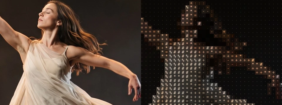
Use it for: a computer or screen world on stage · titles and projections with a typed, hand-made feel · a figure that dissolves into text.
- Cell Size – how big the characters are.
- Background – how much of the picture glows behind them.
- Ramp – which characters draw the picture.
Tip: keyframe Cell Size from 72 down to 10 to let a figure condense out of a few large signs, or Amount from 0 to 1 to type the picture in over the original.
Presets
Section titled “Presets”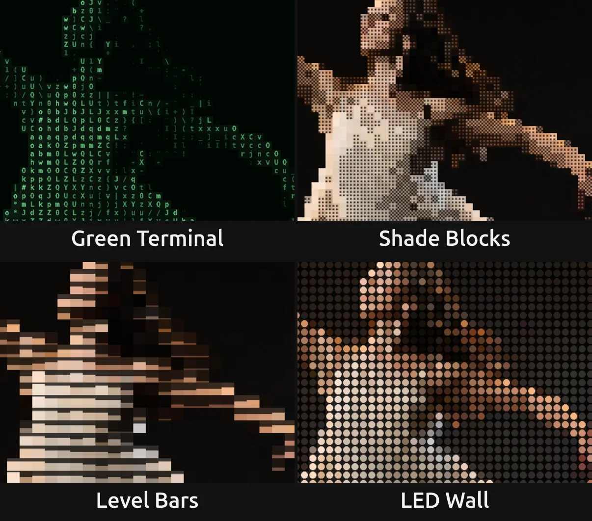
Pick one in the Preset row of the effect card. It sets all controls at once, in one undo step, and the row then shows its name until you change something. A control with keyframes keeps them, and the card says so.
Green Terminal – green letters and signs on black, like the screen of an old computer. Black Level 0.2 turns the grey stage black, so only the lit figure is typed, and its brightest letters glow pale. For a hacker scene, a surveillance feed or a machine that thinks.
Shade Blocks – small cells filled with the shading blocks ░ ▒ ▓ █, in the picture’s colours. The figure stays easy to read and turns into the coarse dotted mosaic of early computer art.
Level Bars – large cells, each a bar that rises with its brightness over a dim picture, like a wall of level meters. The tallest bar stops short of the cell, so the rows stay apart. Graphic and calm; strong on large surfaces and with music.
LED Wall – one round dot per cell in the picture’s colour, like the LEDs of a video wall seen up close. Good for faking a screen inside the stage picture.
Controls
Section titled “Controls”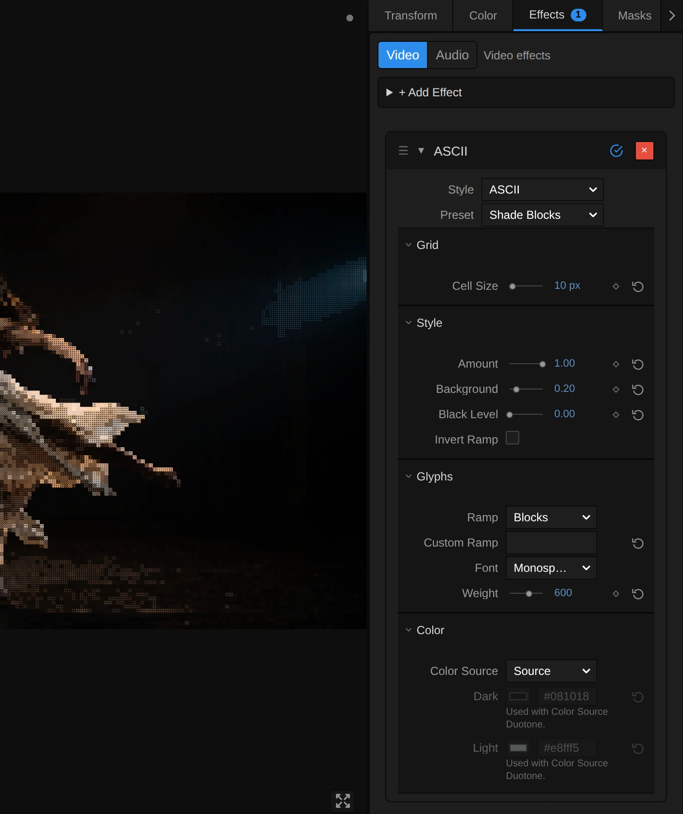
Style – switches to another look of the same engine and keeps your values and keyframes, for example Word Mosaic, Pixel Code or Number Field. The moving looks, such as Glyph Matrix, have Speed and Roll and form their own family.
Cell Size – how big one character is. 6–10 gives fine print that reads as a picture from afar, 14 small but clear characters, 24 and more large signs that read on a projection; at 72 the frame holds only 15 rows of large signs. It counts pixels of a 1080p picture, so the preview, the thumbnails and a 4K export show the same grid. 4 to 72 px, default 14 px.
Amount – how much of the effect you see. At 0 the original picture, unchanged; in between, the characters fade in over it. Keyframe it to type a picture in. 0 to 1, default 1.
Background – how much of the picture fills each cell behind its character. At 0 the characters stand on a near-black ground, like classic ASCII art; 0.2–0.4 lets the picture glow through, so it stays readable; towards 1 the cells take the full colour of their character and the signs disappear into a mosaic. 0 to 1, default 0.2.
Black Level – the brightness up to which the picture counts as black. Everything darker becomes the first character of the ramp, the space in most ramps (with Invert Ramp the last, densest one), so a grey stage drops out and only the lit figure is typed; the rest of the picture spreads over the whole ramp, so the figure gets more different characters. Try 0.15–0.25 on stage footage, above all with Duotone. 0 to 0.9, default 0.
Invert Ramp – swaps the ends of the ramp: dark parts get the dense characters and bright parts the light ones, like a negative typed on paper. The colours stay. Either on or off, default off.
Glyphs
Section titled “Glyphs”Ramp – the row of characters the picture is built from, from the darkest to the brightest part. Standard (.:-=+*#%@ after a space) is classic ASCII art; Detailed uses about seventy letters and signs for finer tones; Blocks fills each cell with the shading blocks ░ ▒ ▓ █; Bars with a bar that rises with brightness; Binary writes only 0 and 1; Numeric the digits 1 to 9; Symbols dots, crosses and stars. While a Custom Ramp is typed, the row rests and the card dims it. In the menu: Standard, Detailed, Blocks, Bars, Binary and 2 more, default Standard.
Custom Ramp – your own characters, from dark to bright, instead of the Ramp. Start with a space so the darkest parts stay empty; a single character, such as ●, puts the same sign in every cell and lets the colour alone carry the picture. Spaces at the end are ignored, and a ramp longer than 256 characters is thinned to 256, spread from its first to its last (the card says so). Clear it to use the Ramp again. Any text, default empty.
Font – the lettering. Monospace draws the even signs of a terminal; Serif and Sans Serif give rounder, bookish letters, each narrowed to fit its cell. Monospace, Serif, Sans Serif, default Monospace.
Weight – how heavy the strokes are. Heavier letters carry more colour, so the picture gets brighter. How many steps you see depends on the font: the built-in monospace font of many systems only has regular (up to 500) and bold (600 and more). Keyframes step from one weight to the next. 200 to 900, default 600.
Color Source – where the colour of the characters comes from. Source takes the colour of the picture under each cell; Duotone colours them between Dark for the dark parts and Light for the bright parts, for a single-colour look. Source, Duotone, default Source.
Dark – the colour of the darkest characters in Duotone; the ground behind them is a deep shade of it. With Source it rests, and the card dims it. Pick a colour, default #081018.
Light – the colour of the brightest characters in Duotone. With Source it rests, and the card dims it. Pick a colour, default #e8fff5.
Node setup
Section titled “Node setup”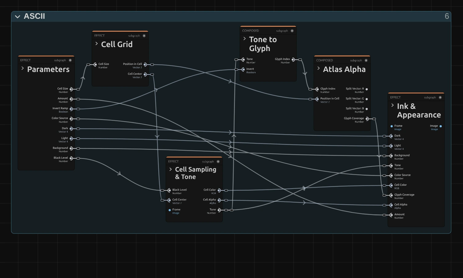
ASCII works in five stages, one folder each in the Nodes tab: Cell Grid cuts the frame into square cells, Cell Sampling & Tone reads the colour and brightness in the middle of each cell, Tone to Glyph picks a character of the ramp for that brightness, Atlas Alpha looks up where the character covers the cell, and Ink & Appearance colours the character and its ground. Click a folder’s header to open it; the sections below show what is inside. ASCII is one look of the glyph engine that the Text & Glyph looks share; its Style menu switches between them.
Cell Grid
Section titled “Cell Grid”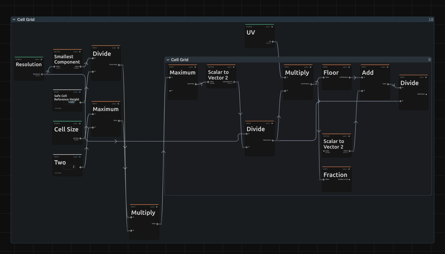
Smallest Component – the shorter side of the frame. Divided by 1080, it says how much larger or smaller this frame is than a 1080p one, so Cell Size looks the same on a 4K export, a portrait frame and a thumbnail.
Maximum – the cell size in pixels of this frame: Cell Size times that scale, and never smaller than 2 pixels. The other Maximum, to the left, first keeps Cell Size at 2 or more.
Floor – which cell the pixel lies in. Multiply spreads the frame over the grid (the frame size divided by the cell size), and Floor drops the fraction, so every pixel of a cell gets the same cell number.
Fraction – the fraction Floor dropped: where the pixel lies inside its cell, from 0 to 1 across and down. Atlas Alpha uses it to draw the character.
Divide – the middle of the cell, as a share of the frame: the cell number plus a half (Add), divided by the grid. Every pixel of a cell reads the picture there, so the whole cell gets one colour and one character.
Cell Sampling & Tone
Section titled “Cell Sampling & Tone”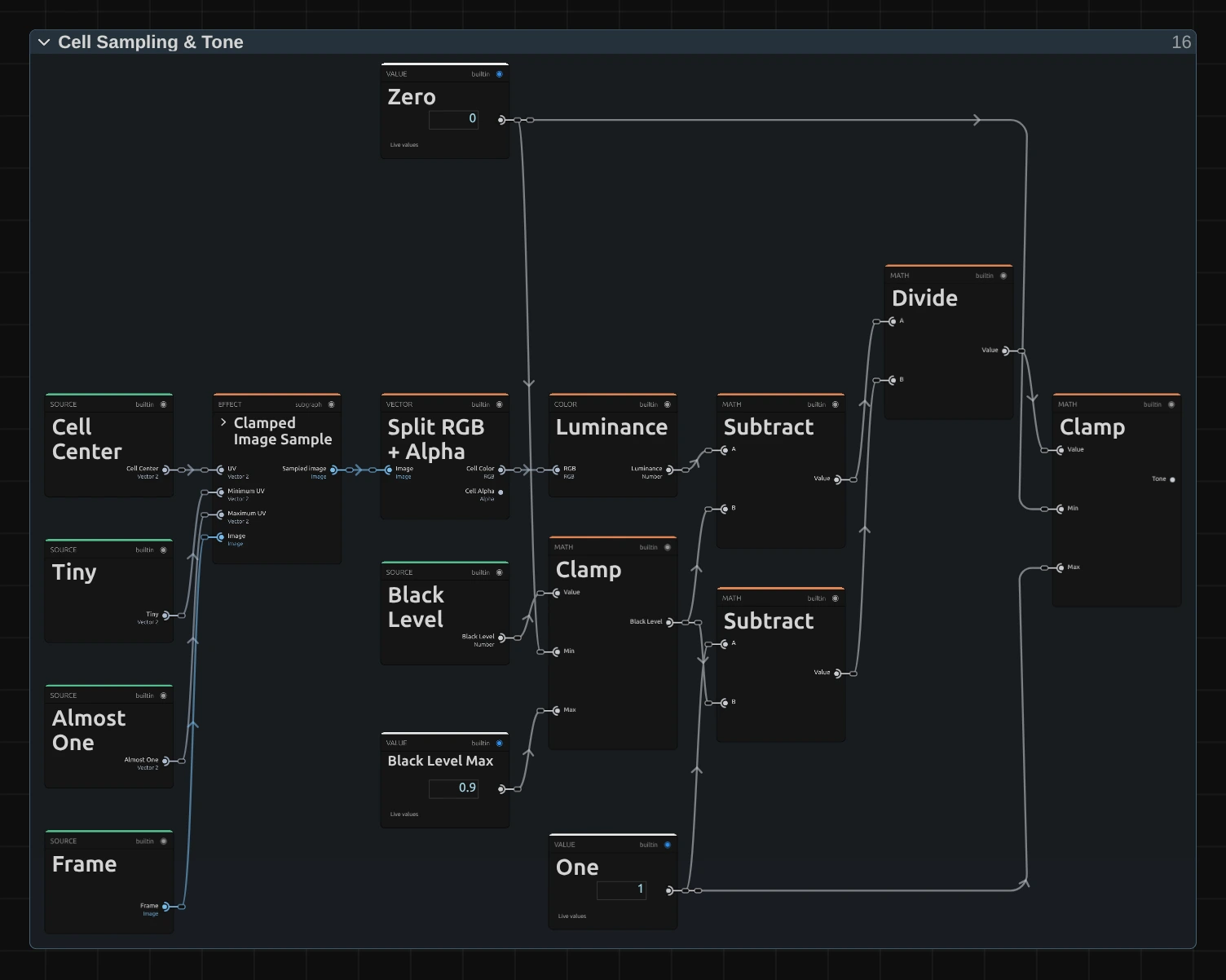
Clamped Image Sample – reads the input picture at the cell centre, but never outside the frame (Tiny 0.001 and Almost One 0.999 are its nearest and farthest place). It holds a small node setup of its own; its › opens it.
Split RGB + Alpha – splits what it read into the cell’s colour and its transparency. The colour becomes the ink of the character, the transparency the transparency of the whole cell.
Luminance – the brightness of the cell colour, weighted the way the eye sees it (green counts most).
Divide – applies Black Level: the luminance minus Black Level (Subtract), divided by what is left above it (the other Subtract: One minus Black Level). The Clamp next to Black Level keeps it between 0 and Black Level Max 0.9.
Clamp – keeps the result between 0 and 1, so everything darker than Black Level becomes 0: the Tone. This tone picks the character.
Tone to Glyph
Section titled “Tone to Glyph”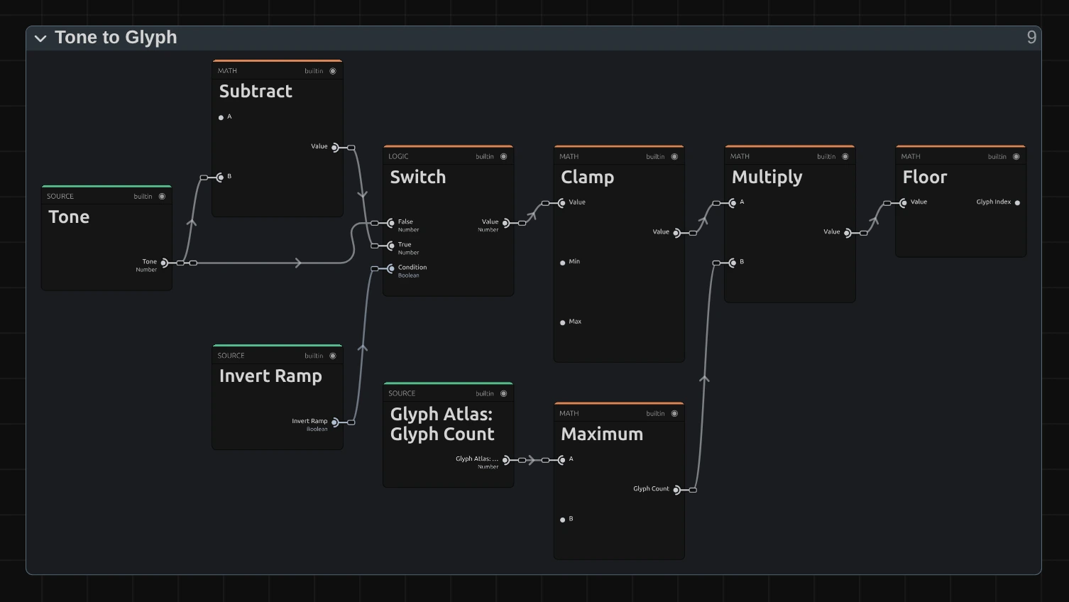
Subtract – one minus the tone: the brightness turned upside down, for Invert Ramp.
Switch – passes the tone as it is, or the inverted one when Invert Ramp is on.
Clamp – keeps the tone between 0 and just under 1, so the brightest cells still get the last character of the ramp and never one past it.
Multiply – the tone times the number of characters in the ramp (the Maximum below keeps that number at 1 or more), so the ramp covers the whole range from black to white.
Floor – drops the fraction: the number of the character, 0 for the first (the space of the Standard ramp) up to the last.
Atlas Alpha
Section titled “Atlas Alpha”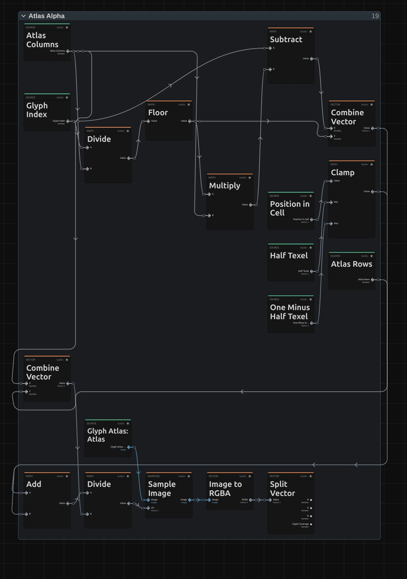
Floor – the glyph index divided by the columns of the sheet, without the fraction: the row in which the character sits.
Subtract – the glyph index minus the row times the columns (Multiply): the column. Combine Vector joins row and column into the character’s square on the sheet.
Clamp – keeps the place inside the cell half a pixel of the sheet away from the edges of the character’s square (Half Texel, 0.5 of the 64 pixels of a square, and One Minus Half Texel). The sheet is read with smoothing, so a read any closer would mix in a little of the neighbouring character: blocks and bars would show thin seams wherever a cell is not a whole number of pixels.
Sample Image – reads the sheet at the character’s square plus the place inside the cell (Add), divided by the size of the sheet (Divide).
Split Vector – takes the alpha of what it read: the Glyph Coverage, 1 inside the strokes of the character, 0 around them, soft at the edges.
Ink & Appearance
Section titled “Ink & Appearance”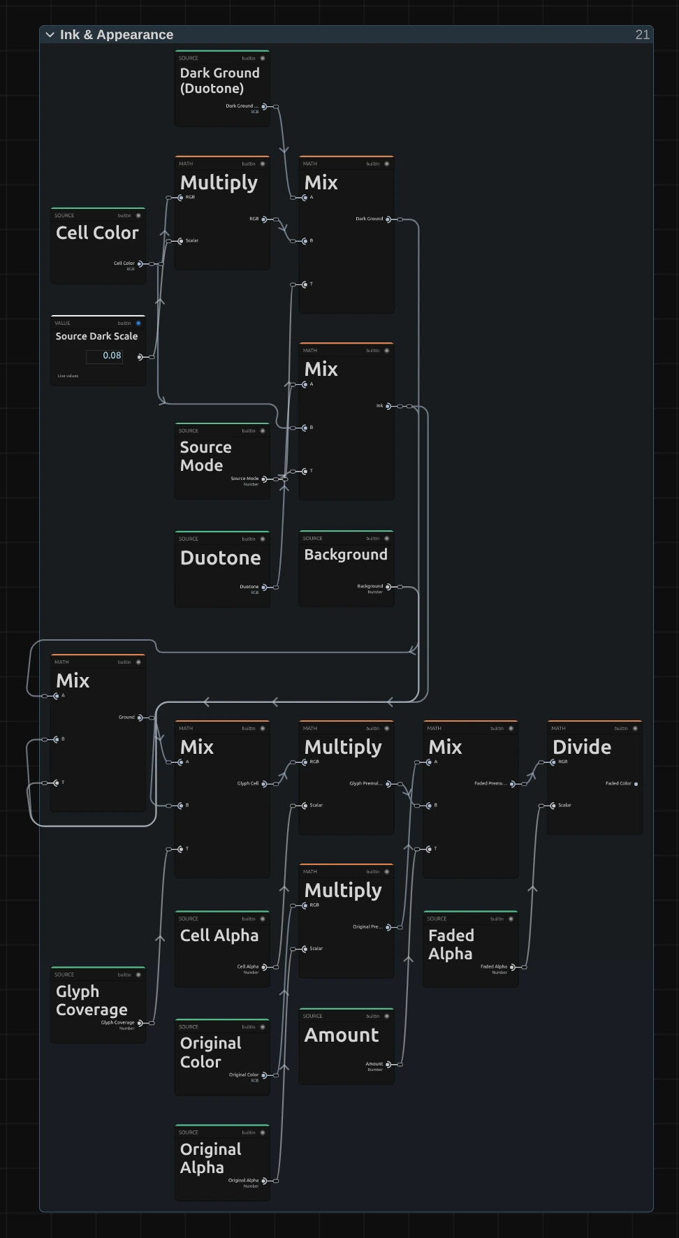
Ink – the colour of the character: the cell colour with Color Source set to Source, the Duotone colour (from Dark to Light by the tone) with Duotone.
Dark Ground – the cell behind the character as classic ASCII art has it: the cell colour times 0.08 with Source, Dark times 0.15 with Duotone.
Ground – mixes the dark ground towards the ink by Background: at 0.2 the cell keeps a fifth of its character’s colour.
Glyph Cell – puts the ink on the ground by the glyph coverage: the character in full colour, its ground around it.
Faded Premultiplied – fades the untouched picture, pixel by pixel, towards the glyph cell by Amount. Both are first multiplied by their transparency (Original Alpha, Cell Alpha), and the transparency fades the same way (Faded Alpha).
Faded Color – divides by Faded Alpha (at least a millionth) to get back to plain colour. Mixed this way, the colour a transparent pixel hides never shows as a dark or green fringe around a cut-out figure while Amount fades.
Remix: open the Constants folder and set the value 0.08 (the Source Dark Scale card above) to 0.3: with Color Source on Source, even at Background 0 the dark ground keeps almost a third of the picture, so the cells glow softly between the characters.
Technical details
Section titled “Technical details”- Size. Cell Size counts pixels of a frame whose shorter side is 1080: a 4K export, a portrait 1080 × 1920 frame, a lower Preview Quality and the thumbnails show the same grid. A cell is never smaller than 2 pixels of the frame; below 2 px Cell Size renders as 2. The card says when either happens.
- Characters. The characters come from an atlas, a sheet the engine draws for the Ramp, Font and Weight and keeps. It draws the whole ramp in one font size, so its tallest character spans 88 % of the cell height and a ‘.’ stays small next to a ‘#’. The Block Elements (█ ▀ ▄ ▌ ▐ ░ ▒ ▓, the bars ▁ to ▇ and the quarter blocks) are drawn as exact shapes that fill their cell in any font, and the sheet is read half a pixel inside each character, so blocks join without seams at any cell size. Weight is drawn in steps of 100. The engine keeps the 24 sheets used last, so typing a long Custom Ramp does not pile up memory.
- Time. ASCII does not move by itself: on footage it changes with every frame of the clip, and a paused picture needs no extra rendering.
- Transparency. Each cell takes the transparency of its centre, so a cut-out figure keeps its outline in whole cells and no character is cut in half. Amount fades the transparency back to the original’s, pixel by pixel, and mixes the colours weighted by their transparency, so the hidden colour of a transparent pixel never shows as a fringe around a cut-out figure.
- Saved projects. An ASCII effect stores its node setup and keeps its look. Effects saved before Background existed show the dark ground (Background 0), and their Amount fades towards the colour of each cell instead of the original picture. A Blocks ramp, a one-character Custom Ramp and a Custom Ramp longer than 256 characters draw as described above in saved projects too. A stored setup keeps its smaller characters, which cover about half of a cell, and the way it read the character sheet, so saved Blocks or Bars can show thin seam lines on frames whose cells are not a whole number of pixels; Black Level is 0 there. A stored setup also keeps the earlier Cell Size in pixels of the output, so its preview at another quality and an export at another size show different grids; add the effect again for the 1080p grid. Presets fully apply only to effects added in this version: on a stored setup from before, the card has no Background, Black Level row, so a preset leaves those values out.
- More: Effect system · Node Catalog · Styles and presets.