
UI & Panels
The editor is one window of dockable panels under a menu bar, with a workspace bar at the bottom that switches between layouts. This page lists the menus, the panels and the built-in layouts; for a guided first look use Info → Tutorials → Workspace Tour, and for keys see Keyboard Shortcuts.
Tablets and desktop browsers use the same editor shell. The Mobile button opens the separate phone editor at /m (Touch Devices).
Menu Bar
Section titled “Menu Bar”Structure
Section titled “Structure”| Menu | Contents |
|---|---|
| File | New Project…, Open Project…, Open Recent, Save now, Duplicate project…, Export .msproj archive…, Rename Project…, Project Info, Clear All Cache & Reload |
| Edit | Copy, Paste, Settings… |
| View | Panels (Core, AI, Scopes), Layouts |
| Output | New Output Window, Open Output Manager, Active Outputs |
| Info | Version, About MasterSelects, Documentation, Help, Social, Tutorials, Legal |
Keyboard Shortcuts
Section titled “Keyboard Shortcuts”| Shortcut | Action |
|---|---|
Ctrl+N |
New Project |
Ctrl+O |
Open Project |
Ctrl+S |
Save now |
Ctrl+Shift+S |
Duplicate project (save under a new name) |
File Menu Details
Section titled “File Menu Details”- New Project… opens the project setup dialog. Spaces in the name are fine; characters a file system cannot store are flagged as you type, and unsaved work is pointed out before anything is replaced.
- Open Project… opens an existing project folder or browser project.
- Open Recent lists the projects this browser remembers; Clear Recent Projects empties the list.
- Save now (
Ctrl+S) waits until every pending change and the workspace are written. Saving is always continuous: each accepted change is written a moment later. Named versions are kept in History. - Duplicate project… saves the project under a new name.
- Export .msproj archive… packs the project into one archive file to move or back it up.
- Rename Project… renames the open project in the same name dialog.
- Project Info shows whether the latest changes are saved (“Content confirmed”).
- Clear All Cache & Reload clears the browser’s stored data, caches and service workers for the editor and reloads it.
Output Menu Details
Section titled “Output Menu Details”- The Output Manager’s target list routes each output to the active composition, a fixed composition or a slot; opening, restoring, closing and removing outputs go through one shared command module (
src/components/outputManager/outputTargetCommands.ts). A restored output with its own source is scheduled for rendering again, closing an output window stops its rendering, and routing an unknown output logs a warning. The target preview asks for a frame right after it registers its canvas, so switching outputs or sources while paused no longer leaves it black.
Info Menu
Section titled “Info Menu”- Version shows the running version; About MasterSelects and Documentation open the about page and these docs.
- Help holds Chat with dev, Leave note and Write issue. The Info button shows
+1while a reply from the developer is unread. - Social links to Discord and Reddit; Instagram is listed but not linked yet.
- Tutorials → Workspace Tour starts the guided tour of the editor.
- Legal holds Imprint, Privacy Policy, Terms, Withdrawal, Cancel contracts here and Contact. Imprint and Privacy Policy open
/impressumand/datenschutzin a new tab; Contact opens the legal dialog in German or English.
The welcome chooser asks which editor you come from and sets the matching shortcut preset. Choosing DaVinci Resolve changes only the shortcut preset, not the interface theme.
Panel System
Section titled “Panel System”Dockable Behavior
Section titled “Dockable Behavior”All docked panels can be:
- Dragged to rearrange
- Grouped in tabs
- Resized via split panes
- Closed, and reopened from View → Panels or a tab bar’s +
- Floated as independent windows
- Maximized from the hovered tab with the fullscreen shortcut
- Dropped into the center of a pane with a large anchored preview, or onto the tab bar for exact tab insertion
- Dropped onto the outer dock edges to create full-height side strips or full-width top/bottom strips
Tab Controls
Section titled “Tab Controls”| Action | Method |
|---|---|
| Switch tab | Click |
| Pan an overflowing tab bar | Middle-mouse drag |
| Drag tab | Hold for 500 ms, then drag |
| Insert into tab group | Drag into the tab group and choose one of the visible gap cubes |
| Maximize hovered tab | Hover a dock tab and use the fullscreen shortcut |
Floating Panels
Section titled “Floating Panels”- Floating panels keep their own position, size, and z-order
- They can be brought to the front by clicking
- They can be redocked by clicking
Dockor by dragging the floating panel title tab onto a dock target
Browser Window Panels
Section titled “Browser Window Panels”Undock to Windowopens a dock tab as a separate browser window- The detached browser window renders the selected panel through the main editor runtime, so edits and controls affect the main app state
- Detached browser windows keep their last local position and size across refreshes
- The detached browser window can return the panel to the main layout with
Dock back
Available Panels
Section titled “Available Panels”Every panel can be added from the + at the end of a tab bar, or swapped in with Change to on a tab’s right-click menu. The menu groups them like this:
| Group | Panels |
|---|---|
| Nodes | Nodes (the node graph of the whole timeline by default; its source selector follows the selected clip (Active) or pins one clip; first entry, opens directly) |
| Editing | Preview, Multi Preview, Timeline, Curves, Media, Layers, Tools, Properties, History, Annotations, Notebook, Stats, Transitions |
| Color | Color Nodes, Color Controls (the Coloring tab of the Video layout), Clips, Mini Timeline, Scopes, Keyframes |
| Audio | Audio Mixer, MIDI Mapping |
| AI | Discover, AI Studio, Story, AI Segment |
| 3D | 3D Scan |
| Live | Go Live, Slot Grid, Stream Chat, Stream Analytics |
| Capture & Output | Capture, Export |
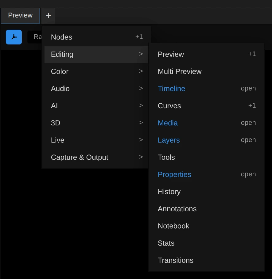
Preview, Nodes, Color Controls, Curves and Slot Grid can be open more than once; every other panel exists once: + brings the open one to the front, and Change to moves it into the clicked slot. A few more panel types (AI Scene Description and the separate Waveform, Histogram and Vectorscope panels) load only from older saved layouts. Feature pages: Preview, Timeline, Media Panel, Keyframes, Notebook, Annotations, Image Mode (Layers, Tools), Slot Grid, Export, Screen Capture, Media Discovery (Discover), AI Studio, Story Workflow, Color Correction.
View Menu Grouping
Section titled “View Menu Grouping”- View → Panels shows most panels in one flyout, grouped into Core, AI and Scopes. A check mark shows which panels are open; clicking an entry opens or closes it.
- Notebook and Transitions are not in this flyout: open them from a tab bar’s + (group Editing).
- View → Layouts saves, loads and sets default layouts (Layout Actions).
Preview Panel
Section titled “Preview Panel”- Main composition output canvas
- Source selector supports the active composition, a named composition, or a layer-index source
- Per-panel transparency grid toggle
- Multiple preview panels can be opened and floated
- Stats overlay is available
Multi Preview Panel
Section titled “Multi Preview Panel”- 4-slot grid for showing multiple compositions at once
- Can auto-distribute the active composition’s layers or use custom per-slot assignments
- Multicam toggle: live camera angles per slot, red frame on the camera on air, keys
1-4cut between cameras - Per-panel transparency grid toggle
Timeline Panel
Section titled “Timeline Panel”- Multi-track video and audio editor
- Composition tabs for switching open compositions
- Playback controls, snapping, and ruler
- Slot Grid overlay is part of the timeline workflow
Media Panel
Section titled “Media Panel”- Media browser with folders, compositions, imported media and project items
- Three views: Classic list, Large icons and Board, switched with the segmented control in the header
- Reorderable column headers in the Classic list
- Folder breadcrumb in the Icons view
- The + Add button in the header and the right-click Add submenu offer Composition, Folder, Import files…, Live Input… and Import Gaussian Splat…; Import opens the file picker directly; text, solids, blank clips, 3D and motion layers are created from the timeline’s right-click menu
- Dragging files or folders from the OS recreates the folder structure inside the project
- Dropping multiple OS files directly on the timeline asks whether to place them side by side or stacked on new layers, while still importing through the Media Panel file path first
- Drag-to-timeline support
- Board mode right-drag supports smooth edge autopan; dragging far out onto a timeline lane hands off to the same timeline drag preview/drop path as list-view media drags, then restores the item at its original board position
- Bottom-right Generate tray expands into the FlashBoard prompt composer for video, image, speech, and music generation without opening a separate dock tab
- Appearance settings include a separate Wooden media panel theme checkbox, default off, that switches the Media Panel to the wooden studio skin; disabling it leaves the standard dark panel chrome unchanged
Export Panel
Section titled “Export Panel”- Presets, Output (name, container, method), Video or Image, Audio, Range & Summary and Render Quality, top to bottom, with the green Export button at the bottom
- Methods: WebCodecs Fast, HTMLVideo Precise, FFmpeg CPU and HAP GPU; FCPXML is a container choice
- Video, audio or image items dragged from the Media panel onto it form a batch queue
- Details: Export
MIDI Mapping Panel
Section titled “MIDI Mapping Panel”- Open from View → Panels → MIDI Mapping
- Shows all currently assigned MIDI notes and control-change bindings in one list
- Includes global transport bindings, per-marker bindings, Slot Grid trigger bindings, and property parameter bindings
- Each row shows the note, target, and resulting command behavior
- Click any transport, marker, or slot mapping card to trigger the assigned action and preview what the MIDI note does
- Mappings flash live while matching MIDI input is currently driving them
Editopens inline controls for manual channel/note changes and marker reassignment- Parameter mappings expose inline
Min/Maxrange inputs, anInverttoggle, and aDampcheckbox for smoothed value changes LearnandClearremain available directly from the panel- Marker bindings support
Jump To Marker,Play From Marker, andJump To Marker And Stop - Slot bindings can be created from the Slot Grid filled-slot context menu, which opens this panel with a pending
Listening...mapping
Capture Panel
Section titled “Capture Panel”- Capture (Screen Capture) records a display, window, or browser tab directly into an open project
- Supports display and microphone audio, cursor capture, preview, pause/resume, and recovery of interrupted recordings
- Imports completed recordings into
Recordings; when enabled, the experimental WebCodecs tier adds crop and scale controls
AI Segment Panel
Section titled “AI Segment Panel”- SAM2 object segmentation in the browser
- Point-based include/exclude workflow
- Real-time mask overlay
- Forward propagation for video
Media Generator Tray
Section titled “Media Generator Tray”- Compact bottom-right
Chat/Generate/Studio/Downloadslauncher inside the Media Panel - Expanded tray embeds only the compact FlashBoard prompt composer for hosted video, image, ElevenLabs audio, and Suno music flows
- Studio opens a separate dock panel with parallel, persistent generation tabs and draggable result tiles; the compact Generate tray works beside it
- Active generation jobs render as compact preview cards above the prompt, including queued/processing state, elapsed timer, progress, prompt, and failed-job dismissal
- Service and provider selection reflect the active backend through the FlashBoard composer
- Image, video, and audio media can be attached as ordered prompt references from the Media Panel context menu or by dragging them onto the expanded composer
- Current generation backends route through MasterSelects Cloud. Hosted Kie.ai media, ElevenLabs speech, and Suno music use Cloud credits; provider credentials do not enter browser settings.
FlashBoard Prompt Composer
Section titled “FlashBoard Prompt Composer”- Composer panel for prompt/text-to-speech/music input, ordered media references, output/model selection, duration, aspect ratio, mode, multi-shot authoring, audio voice settings, and Suno song controls
- Completed generations are imported back into the media store and can be sent to the timeline; ElevenLabs and Suno audio imports under
AI Gen / Audio - The tray reuses the FlashBoard queue/import runtime without showing the full node canvas
Media Downloads
Section titled “Media Downloads”- Downloads open from the bottom of the Media panel beside Generate and Chat
- Paste one or more URLs from major platforms
- Downloads use the same Media tray queue as generated media
- Completed downloads are imported back into the Media panel under Downloads/platform folders
Transitions Panel
Section titled “Transitions Panel”- Draggable transition palette for the current 2D and 3D transition families, including dissolve/dip, wipe/iris, push/slide, dedicated 2D rotate, stylize, glitch, light, zoom, motion blur, pattern, and 2.5D flip/card/roll/spinback variants.
- The palette is grouped into 2D and 3D sections. Related variants appear as a single family card; dissolve style, direction, shape, color, motion-blur style, light/film style, or pattern variants are selected in the transition-scoped Properties tab. The 2D and 3D sections can be collapsed when browsing the palette.
- Search filters grouped family cards by family names, transition IDs, variant names, descriptions, category aliases, synonym aliases such as film/depth/lens, and 2D/3D dimension labels. Glitch search includes hidden RGB split, mosaic, pixelate, and scanline variants even though the palette shows one Glitch family card. Light search includes Flash, Light Leak, Light Sweep, Projector Flicker, Film Roll, and Vignette Bloom variants while the palette keeps them grouped as one Light family. Pattern search includes visible multi-panel Puzzle Push, Shatter Glass, and Magnetic Tiles variants through the grouped Pattern family. 3D search includes separate Flip, Tumble, Roll, and Spin families for the current runtime effects. Search results stay expanded even if a section was collapsed before searching.
- Family cards show a variant count. Clicking a family expands the draggable leaf variants until the pointer leaves the panel.
- Transition cards render through the transition-preview renderer map, with a generic SVG fallback when a transition has no dedicated preview renderer.
- Family-card assembly, sectioning, and search indexing live in focused transition panel helpers so the panel layout does not grow with each new transition definition.
- The transition Properties tab uses the same grouped 2D/3D selector model; its choice-button metadata and glyph mapping are kept in focused helpers so the Properties tab can grow by family without adding more panel-state code.
- Each transition item carries a plain JSON drag payload with transition ID and duration.
- The duration control keeps only the minimum bound; long transitions are allowed and rely on hold-frame fallback where source material runs out.
- Timeline hover uses source-aware ghosts: normal transition body, real-handle coverage, and red hold-frame fallback coverage.
- Open it from a tab bar’s + (group Editing); it is not in View → Panels.
Scopes Panel
Section titled “Scopes Panel”One Scopes panel (View → Panels → Scopes, or the Color group of +) shows one GPU-rendered scope at a time; its Scope type menu switches between:
| Scope | Shows |
|---|---|
| Parade | red, green and blue waveforms side by side (the default) |
| Waveform | brightness or RGB across the picture |
| Vectorscope | hue and saturation |
| Histogram | how many pixels sit at each brightness |
- Waveform and Histogram offer the view modes RGB, R, G, B and Y (luma)
- An IRE scale is drawn beside the waveform
- The scopes are fully GPU-rendered. Waveform analysis computes only the channels required by the selected view and uses adaptive vertical sampling for HD/UHD sources while preserving exact horizontal sampling.
- An unchanged paused frame is not analyzed repeatedly. Resizing a scope panel invalidates that cache once after the resize settles so the paused scope redraws at its new dimensions.
Slot Grid
Section titled “Slot Grid”The Slot Grid is a 12 × 4 launch grid over the Timeline for playing compositions live. See Slot Grid.
Resolve Interface Theme
Section titled “Resolve Interface Theme”The Resolve theme is hidden and disabled by default. Existing persisted
Resolve selections migrate back to Dark. While Settings → Appearance is
open, holding Shift and pressing 1, 2, 3, 4 in sequence permanently
unlocks its theme card for that user. Its palette and geometry are derived from
semantic surface, separator, typography, control, selection, and timeline
tokens, so shared editor chrome can be tuned from one theme module. The theme
uses compact neutral panels, restrained one-pixel separators, blue tool
emphasis, and a separate red timeline playhead token.
The factory Video workspace has a Resolve-only arrangement: Media, AI Studio, and Nodes occupy the full-height left column; Preview and the right inspector group sit above Timeline. The right group contains Properties, Layers, Coloring, and Export at native 100% panel scale. Other themes continue to load the standard Video layout, so the Resolve geometry never leaks into their saved factory state.
The migration is intentionally incremental. The Transform inspector is the first complete component family; remaining inspector sections and editor workspaces continue to use compatibility mappings until their Resolve-style counterparts land. See Node Workspace for the graph workspace controls.
Properties Panel
Section titled “Properties Panel”The unified Properties panel adapts its tabs to the selected clip type, selected audio track/layer, selected master bus, and slot-grid mode. Its dock tab is always titled Properties and uses a slightly lighter tab surface than neighboring panels. Transcript controls live inside Analysis; linked video/audio companions share the same transcript state, so selecting either side opens the same Analysis workspace. Clips that support both layer dimensions expose the 2D/3D switch in the Transform section, while model, Gaussian-splat, light, and effector clips that require 3D show a static 3D badge instead of a disabled switch. The Source row does not repeat the dimension switch.
Properties remembers the last clip tab the user opened and its vertical scroll position, including while the dock panel is hidden. Selecting another clip reopens that tab when the clip offers it; incompatible tabs use the clip’s default without forgetting the user’s choice.
Selecting a timeline transition switches the panel to TRANSITION Parameters.
That tab shows the transition type, first-pass centered placement with timeline
body offset support,
hold-frame policy, duration, body range, real source-handle duration,
hold fallback duration, and remove action. The same duration edit operation is
used by the selected timeline body’s drag-resize handle; dragging the body
updates the transition offset relative to the cut. Timeline body moves snap to
the centered cut position and source-handle edges; resize handles snap to the
same source-handle edges.
Standard Video Clip Tabs
Section titled “Standard Video Clip Tabs”| Tab | Contents |
|---|---|
| Transform | Compact Source, Transform, Composite, Speed Change, Cropping, and Stabilization sections with transform, opacity, blend, speed, crop, keyframe, and reset controls |
| Color / Image | Clip-level color correction, in every theme including the hidden Resolve theme |
| Effects | Applied video effects and an expandable Color grade; Video / Audio switch exposes clip or linked-audio effects (hidden by default for visual clips). |
| Masks | Mask shapes with mode and feather controls |
| Analysis | Shared analysis map, transcript controls, and compact scene blobs with faces, synchronized dialogue, cuts, metrics, quality, and descriptions |
The Resolve inspector keeps the clip-level Color tab, presented as Image in the Resolve tab design. The dockable Color Controls panel is an additional surface and can be placed more than once.
The Analysis workspace uses one source-time model for its collapsible graph and segment list. Visual scene boundaries remain unchanged in the graph, while the list independently divides long dialogue into readable speech segments. Speaker changes and long pauses are hard natural boundaries; sentence endings nearest the 10-second target are preferred, and unpunctuated speech is split at a word boundary before 15 seconds. Within those semantic boundaries, the measured dialogue-column width supplies a bounded character budget: narrow panels create shorter bubbles and wide panels keep more words together without hiding them behind a fixed-size split. This keeps talking-head footage navigable even when cut detection returns one long scene. The list consumes all remaining panel height and owns its scroll. Each virtualized segment keeps visible face crops on the left with a separate transcript-speaker abbreviation beside them, larger word-synchronized dialogue across the remaining width. The compact scene/speech label keeps the segment-start seek action and exposes timing details as a tooltip. Speaker labels are not silently equated with anonymous face identities. Segments remain compact and never expand. Clicking a word seeks to that exact word; clicking the scene/speech label seeks to the speech-segment start (or the scene start when no speech exists). Redundant playhead and clip-summary statistics are omitted. Face crops remain lazy because only the bounded virtualized window resolves thumbnails.
The source-wide people/review correction strip lives in Analysis settings so the normal scene list stays focused. It deliberately reuses the same person and review identities as scene cards: drag a person to merge, an appearance to move it, or a review track to assign it. Crop loading remains viewport-lazy.
The Action Center above the map is a single compact row of status pills using the same flat control treatment as Export. Each pill exposes its channel state and triggers analyze, reanalyze, continue, retry, or cancel as appropriate. Analyze all and a settings button complete the row. The settings disclosure uses separate compact areas for shared visual-analysis controls and transcript controls. It keeps only control titles, scope/profile choices, language/mode, and actions visible; estimates and explanatory copy do not push the map down. Quick/Balanced Focus/Motion and Faces execute with the selected source interval and sampling cadence; frame-accurate cuts remain source-wide. Deep/Custom stay blocked without qualifying evidence. Analyze All deliberately excludes AI scene descriptions, which remain an explicit opt-in because they can incur provider cost and share visual content externally.
Analysis contains the transcript workspace header for provider and language selection, start/continue/cancel/clear, fusion progress, coverage, and shared search. The same search filters individual rows in the virtualized segment list. Words are grouped into timestamped speaker turns and readable timed segments; clicking a word seeks the playhead to that source position. During playback, the currently spoken word and active speech segment are highlighted and the list follows them when that segment is visible under the current search filter. Follow mode centers each active segment vertically instead of pinning it to a viewport edge. Scrubbing updates the same highlight without animated lag.
For audio-bearing clips, the overview also renders an Audio sparkline lane
from loaded loudness and VAD spans plus a Markers needle lane for persisted
speech markers. The Audio Intelligence Action Center card reports analysis
state, progress, and marker count and supports run/re-run or cancel. Inside the
Analysis settings disclosure, AnalysisAudioSettings lists the persisted age
of VAD, alignment, markers, prosody, and room-tone artifacts and provides the
same run/re-run or cancel control.
The Media panel’s Regenerate > Transcript entry names and uses the provider chosen in Settings > Transcription (for example Deepgram only), like the timeline clip menu instead of always running Best Quality.
Best Quality uses a fixed provider split: Deepgram supplies every displayed word and timestamp, while OpenAI supplies the speaker turns. The summary states these two roles directly.
The transcript workspace header uses one compact surface for language, quality mode, actions, progress, coverage, and search. An active run replaces the completed-result summary instead of stacking contradictory states. Best Quality shows Deepgram, OpenAI, and Speakers as three compact stages beneath one overall progress rail. Cancel aborts local, direct-provider, hosted Cloudflare requests and restores the most recently completed transcript when re-transcription is stopped.
Resolve-style Transform Inspector
Section titled “Resolve-style Transform Inspector”The compact Video Transform inspector is shared by the standard and Resolve themes. It is built from reusable section, disclosure, row, numeric-field, linked-pair, icon-button, keyframe, and reset primitives rather than component-local visual constants. Its fixed order is Source, Transform, Composite, Speed Change, Cropping, and Stabilization. Transform and Composite open by default; Speed Change and Cropping start closed; Stabilization remains gray and cannot be opened until it has an implementation.
- Zoom X/Y use Resolve multiplier units and can be linked or edited independently.
- Position retains composition-pixel units for 2D clips and scene units for 3D clips.
- Rotation Angle, Pitch, and Yaw share compact draggable values and slider controls.
- Flip X/Y, Fit, per-row reset, whole-section reset, keyframe recording, MIDI targets, and history batching continue through the existing editor actions. A reset restores defaults and removes the affected keyframes. Section-level keyframe and reset actions operate on every property in that section.
- Anchor Point is visibly disabled until its data-model, renderer, keyframe, and serialization path exists; the UI does not claim a non-functional edit.
- Cropping exposes left, right, top, bottom, and softness controls. Editing these values creates or updates one hidden semantic intersect mask, so crop preview, export, undo, and project persistence share the existing mask path.
- Transform, Composite, Speed Change, Cropping, and Stabilization use the shared compact disclosure treatment. Container-based narrow-panel rules keep the rows usable when the Properties panel is made very narrow.
Audio Clip Tabs
Section titled “Audio Clip Tabs”| Tab | Contents |
|---|---|
| Effects | Audio effects and linked audio controls |
| Audio Edits | Non-destructive edit-stack operations |
| Analysis | Audio-safe analysis workspace with the shared transcript and its provider controls; visual channels remain explicitly unavailable |
Audio Track And Master Tabs
Section titled “Audio Track And Master Tabs”| Target | Tabs |
|---|---|
| Audio track/layer | Controls, Effects, Sends |
| Master bus | Controls, Effects |
Text and 3D Text Tabs
Section titled “Text and 3D Text Tabs”| Clip Type | Tabs |
|---|---|
| Text | Text, Transform, Effects, Masks |
| 3D Text | 3D Text, Transform, Effects, Masks |
Specialized Clip Tabs
Section titled “Specialized Clip Tabs”| Clip Type | Tabs |
|---|---|
| Vector Animation | Lottie/Rive, Transform, Effects, Masks |
| Gaussian avatar | Blendshapes, Transform, Effects, Masks |
| Gaussian splat | Transform, Gaussian Splat, Effects, Masks |
| Camera | Transform |
| Splat effector | Transform, Effector |
| Slot Grid clip | Slot Clip |
Camera Transform Controls
Section titled “Camera Transform Controls”- Camera clips expose
Nav Modecontrols at the top of the Transform tab. - Camera lens and gate controls also live in the Transform tab: FOV, full-frame-equivalent millimeters, Near, Far, and Resolution X/Y.
- In Scene Nav, mouse wheel over the preview moves the real camera position along the current view direction, so X/Y/Z can all change. It does not change FOV or the mm lens field.
- Camera Position X/Y/Z is the camera eye position in world space and is edited independently from lens FOV/mm; changing the lens does not rewrite or recalculate the position fields.
- Camera Resolution X/Y sets the edit-view gate aspect used to draw the camera frame; it is stored with the camera clip and has keyframe controls like the other camera settings.
- Camera Edit mode uses its own 35 mm free-camera lens by default, independent of the timeline camera clip’s lens or keyframes.
FPSswitches preview navigation between orbit-style look and FPS-style look.NO KFkeeps existing camera keyframes active during playback, but routes preview navigation and MIDI camera-look input into temporary live offsets instead of writing new camera keyframes.- Live
NO KFoffsets are added on top of the keyframed camera pose for preview control and are cleared whenNO KFis turned off. - Live
NO KFoffsets are not saved to the project and are ignored for export renders, so the stored camera animation remains the source of truth.
Solid Clip Behavior
Section titled “Solid Clip Behavior”- Solid clips show a color picker bar above the tabs
- The picker updates the clip color in place
Tab Behavior
Section titled “Tab Behavior”- Tabs switch automatically based on clip type
- Properties tabs hide their horizontal scrollbar. Compact previous/next controls appear only when more tabs exist in that direction and reveal one additional tab per click. Manual navigation stays where the user leaves it; when the active tab is outside the viewport, its direction control is highlighted instead of pulling the strip back automatically. Hovering a direction control advances one additional tab every 500 ms until the pointer leaves it or the strip reaches that end. A manual click advances immediately, pauses that hover timer for two seconds, and then resumes the 500 ms cadence. Tab movement and direction-control entry/exit are animated smoothly.
- Clicking an audio track/layer in the Timeline or a strip in the Audio Mixer selects the same
TRACKProperties target, highlights both surfaces, and smoothly reveals off-screen timeline audio layers - Clicking the master bus selects the
MASTERProperties target - Badge counts appear for effects, masks, transcripts, and analysis readiness
- Slot grid mode switches the panel to the Slot Clip tab
- The Slot Clip tab shows the slotted composition tracks, the configured trim window, and the current live layer playhead on one range timeline
Dock Layouts
Section titled “Dock Layouts”Built-In Layouts
Section titled “Built-In Layouts”The workspace bar at the bottom of the editor switches between the built-in layouts Video, Audio, 3D, Color, Image, Live and Chat, plus your own saved layouts. Video is the default:
- Left: Media, AI Studio and Nodes as tabs
- Center: Preview
- Right: Properties, Layers, Export and Coloring as tabs
- Bottom: Timeline
Its timeline starts with two 70 px video tracks and one compact 48 px audio track. On a first load, Video is also the active named layout, so the workspace bar and the Layouts menu show it as current.
Audio puts the Timeline on top, with Media, Discover and Nodes, the Audio Mixer, and Properties, Export and AI Studio below it. Its timeline focuses on audio: two 40 px video tracks for context and one 96 px audio track.
3D shows four Preview panels in a 2 × 2 grid above the Timeline, with Media, Discover and Nodes and Properties, Export and AI Studio at the side. The previews open in Edit mode as Front, Side, Top and Perspective views. Loading the layout keeps the playhead when a camera clip covers it, jumps to the earliest camera otherwise, and creates one camera clip the length of the composition only when there is none.
Color is the grading workspace: Preview, Color Nodes, the clip strip (Clips) and Mini Timeline, Color Controls, and Scopes and Keyframes (Color Correction).
Image edits still images: the Tools strip at the left edge, Media/AI Studio/AI Segment next to it, the Preview as a 2D edit canvas with the transparency grid in the center, and Layers/History above Properties/Coloring/Export on the right, without a timeline. See Image Mode.
Live is for streaming and shows: two layer previews, Go Live, Media and Properties, the Program preview, Analytics, the Timeline and Stream Chat.
Chat fills the editor with the AI chat.
Medium and Mobile are presentation modifiers above the selected named layout rather than separate layout entries (src/stores/dockStore/overLayoutMode.ts, src/components/dock/useOverLayoutSync.ts). The legacy Mobile dock layout is switched off (owner decision 2026-10-27; src/stores/dockStore/legacyMobileLayout.ts): the phone editor at /m is the mobile view. While it is off, nothing enters the Mobile arrangement: no automatic switch on narrow windows or detected mobile devices, no manual entry, and no settings toggle. A Mobile layout or Mobile override persisted by an earlier session returns once to the layout underneath it on load (or to Medium, if Medium was stacked with it); other layout choices stay. The rest of this paragraph describes the legacy behaviour for when the switch is on again. The bottom workspace bar exposes a Medium toggle and a Mobile button beside Layouts while continuing to highlight the underlying Video, Audio, 3D, Color, Image, or custom layout. The two modifiers stack: Medium alone applies the Medium editing arrangement (and the app--medium-experience styling) over the base workspace, Mobile alone applies the compact phone/tablet arrangement, and Medium plus Mobile applies the Medium-Mobile timeline skin (src/components/timeline/MediumMobileTimeline.css) in which the main timeline controls move from the ruler strip into the timebar, the mobile action bubbles are suppressed, and the Preview split uses Medium-specific ratios. Changing the base layout while a modifier is active immediately reapplies the matching arrangement; turning the modifiers off restores the saved panel and timeline arrangement from before they were entered. That pre-modifier snapshot lives in memory only, so after a page reload turning the modifiers off restores the factory arrangement of the base layout instead. Its horizontal/portrait arrangement is selected internally from the active composition aspect. On each entry into either Mobile arrangement, the Preview split is fitted once to the active composition; subsequent divider changes remain under user control until Mobile or the underlying layout is entered again. Phones open the phone editor at /m instead of this editor. On every device the Mobile button saves the project and opens the phone editor; it is a navigation button, not a pressed toggle, and stays disabled while the phone editor opens. Layouts → Phone editor does the same (src/components/common/openPhoneEditor.ts); it waits while an export is running and says so. With the legacy layout on, browser widths at or below the compact breakpoint follow Settings → General → Automatically use Mobile layout when space is limited; that setting is hidden while it is off. In the Video workspace and both internal Mobile factories, AI Studio sits in the left group and Coloring in the right group.
At toolbar widths of 767 px or less, the row of named layout buttons collapses into one light-gray Layout control. Click or touch opens a compact, color-neutral refracted-glass bubble containing every available layout; choosing one loads it and closes the picker. Escape and an outside press also close the menu.
Multi Preview, scopes, and other panels are available from the View menu and can be floated or docked.
Layout Persistence
Section titled “Layout Persistence”- The dock layout is persisted with Zustand and project state
- Floating panels are restored across sessions
- Browser window panels are restored from local dock state on refresh and stay connected when project layout hydration runs
- Invalid panel types are cleaned up on load
- Named layouts can be stored in the View menu and reused
- The active named layout can be overwritten directly with
Save to Current Layout - Named layouts also store the timeline audio focus/display mode, track slot counts, per-slot heights, and track visibility
- Loading a saved layout animates panel movement, resizing, and reflow over 500ms
- A saved layout can be marked as the default layout
- Loading a layout creates missing tracks for saved slots without deleting extra existing tracks
- Splitter touch hit areas extend on both sides of the visible divider. A touch directly on the physical divider starts and captures resizing immediately, while the expanded area beside it waits for directed movement so an ordinary nearby tap remains available to the panel.
Tab Context Menu
Section titled “Tab Context Menu”Nodes is the first direct entry in both the add-panel menu and Change to, and the first panel under View → Panels. Color → Color Nodes opens the specialized grading graph: it edits the same color state as the Color controls. Restored layouts rename the old generic Color-panel title to Color Nodes; custom tab names are preserved. The Nodes canvas keeps its grid visible while panning, so spatial orientation does not disappear during a drag.
Right-clicking a dock tab opens a tab menu. Undock moves that tab into a freely movable and
resizable floating panel, Undock to Window opens it in a separate browser window with a Dock back
control, Hide removes that tab, and Change to replaces the tab slot with another panel. If the
target panel is already open elsewhere, it is moved into the clicked slot instead of creating a
duplicate. The Change to submenu overlaps the parent-menu edge so it stays open while the pointer
moves between the two surfaces. The Timeline panel uses composition tabs instead of a normal panel tab and intentionally
does not expose this panel context menu. Each composition tab keeps its full-height close target at
the far-right edge for reliable mouse and touch input. Closing the active composition tab switches
directly to its neighbor without running the normal composition-change animation.
Layout Actions
Section titled “Layout Actions”| Action | Location |
|---|---|
| Save Current Layout | View → Layouts |
| Save to Current Layout | View → Layouts |
| Load Saved Layout | View → Layouts |
| Set Current as Default | View → Layouts |
| Set Saved Layout as Default | View → Layouts |
| Load Default Layout | View → Layouts |
| Toggle Medium presentation | Bottom workspace bar, beside Layouts |
Open the phone editor (/m) |
Mobile in the bottom workspace bar, or Layouts → Phone editor |
MIDI Control
Section titled “MIDI Control”Enabling MIDI
Section titled “Enabling MIDI”Edit → Settings… → MIDI
Requirements
Section titled “Requirements”- Browser Web MIDI API support
- MIDI device connected
- Permission granted
Status Display
Section titled “Status Display”MIDI Control (N devices)Mapping Overview
Section titled “Mapping Overview”- View → Panels → MIDI Mapping opens the dedicated mapping panel
- The panel lists all assigned transport, marker, slot, and parameter bindings
- Clicking a binding previews the exact trigger path without needing a physical MIDI note
- Matching mappings flash in the panel when the hardware input is used
- Parameter bindings can be range-adjusted, inverted, and damped directly in the mapping panel
- Empty-state guidance points back to Settings and the marker right-click menu
- Right-click a numeric parameter name in the Properties panel to open its MIDI menu and learn or clear a MIDI note/CC binding. Right-clicking the numeric value itself still resets the value to its default. Learned CC values map across the parameter’s configured range and then use the same edit path as manual changes.
Resolution Settings
Section titled “Resolution Settings”Output Resolution
Section titled “Output Resolution”Set in Settings → General → Output — Default Resolution for new compositions; the Frame Rate row beside it changes the open composition.
| Preset | Dimensions |
|---|---|
| 1080p | 1920 x 1080 |
| 1440p | 2560 x 1440 |
| 4K | 3840 x 2160 |
| 9:16 | 1080 x 1920 |
Custom width and height are also supported. This applies to newly created compositions; the active composition can still be configured per item in the Media panel.
Preview Quality
Section titled “Preview Quality”Set in Settings → General → Preview Resolution.
| Option | Render Size |
|---|---|
| Full | 100% |
| Half | 50% |
| Quarter | 25% |
Lower preview quality reduces GPU workload and memory use on engine-backed preview targets. It does not change export resolution or the HTML-only source monitor.
Settings Dialog
Section titled “Settings Dialog”Opening
Section titled “Opening”Edit → Settings…
Categories
Section titled “Categories”| Category | Contents |
|---|---|
| General | Copy media to project folder, the Project storage note (saving is continuous), product analytics, timeline zoom anchor, Deselect selected clips on repeat click, automatic Mobile layout (hidden while the legacy Mobile dock layout is off), shortcut and mouse-click display, default output resolution and frame rate, preview resolution, scrub cache, GPU power preference, and AI features (AI Replay, MatAnyone2) |
| Import | Copy media to project folder (the same switch as in General), Copy media that cannot stay linked, and the external source folders the project may read from |
| MIDI | Browser MIDI permission state, transport learning, and device list |
| Shortcuts | Preset selection, overrides, recorder, reset, and custom preset controls |
| Appearance | Dark, Light, Midnight, System, Crazy You, and Custom theme selection; custom theme controls, interface text scale, interface font, high-readability colors, and studio surface skins |
| Audio | Browser input/output device selection, latency mode, device API status, output-routing status, and AudioContext diagnostics |
| Transcription | Provider selection and pricing |
| Native Helper | Native helper connection, port, helper-backed flows, and decode settings |
| Integrations | Optional YouTube Data API key; AI uses authenticated hosted services |
Integrations
Section titled “Integrations”The only key you can enter is the optional YouTube Data API v3 key. AI features use authenticated hosted services rather than user-entered provider keys in Settings.
Status Indicator
Section titled “Status Indicator”WebGPU Status
Section titled “WebGPU Status”In the expanded preview statistics overlay:
WebGPU (Vendor) when GPU information is availableInitializing WebGPU... during preview initializationNative Helper Status
Section titled “Native Helper Status”- Shows connection state when Native Helper is enabled
- Used for downloads, project file operations, and local AI bridge access
Context Menus
Section titled “Context Menus”Behavior
Section titled “Behavior”- Right-click to open
- Stay within viewport bounds
- Close on outside click
Common Options
Section titled “Common Options”- Rename
- Delete
- Settings
- Context-specific actions
Touch Devices
Section titled “Touch Devices”Phones use the separate phone editor at /m; the Mobile button opens it from any device. Tablets use the same docked editor shell as desktop browsers. The legacy responsive Mobile dock layout is switched off for now, so coarse-pointer devices and narrow windows stay in the desktop layout. When it is switched on again, coarse-pointer devices, narrow browser windows, and portrait compositions can activate it automatically when the default-on setting is enabled. The internal horizontal/portrait choice is intentionally hidden behind the single MOBILE toolbar entry. Project hydration preserves the active device-managed Mobile dock tree, including its Properties group, instead of replacing it with a stale saved project layout. Touch-specific input support stays inside the shared timeline and panels: one-tap native media import, direct clip move and trim, ruler/playhead scrubbing, two-finger timeline zoom, long-press context menus positioned above the finger, double-tap Media Panel context menus, responsive Media Panel-to-Timeline dragging after a brief intent window, fast initial swipes reserved for native Classic Media-list scrolling, immediately captured dock splitters when the visible divider is touched, one-finger 3D orbit, and continuous two-finger camera dolly.
Tools Panel
Section titled “Tools Panel”The tools panel (src/components/panels/tools/) is a 40 px strip of tool buttons, like Photoshop’s toolbar. It is in the Image layout and can be added to any other layout from the Editing panel menu.
- Target: it follows the surface clicked last. Clicking a Preview shows the canvas tools; clicking the Timeline shows the Timeline’s tool groups. Two small buttons at the top switch the target by hand; they only appear while a Timeline panel is open.
- Canvas tools (
src/stores/canvasToolStore.ts,src/services/canvasTools.ts), active while the Preview is in Edit mode:- Move (
V): select, move and scale layers as before. - Hand (
H): a left drag pans the view. Middle drag and Alt-drag still pan with any tool. - Zoom (
Z): a click zooms in around the pointer, Alt-click zooms out. - Text (
T): a click places a text layer at that point, selects it and returns to Move. - Rectangle, ellipse and pen mask (
R,E,P): start drawing a mask on the selected layer and open the Properties Masks tab, whose overlay draws it. They are disabled without a selected layer. - AI Segment opens the AI Segment panel and turns on click-to-segment when its model is loaded.
- Move (
- Timeline tools: one button per tool group (selection, cut, trim, placement, navigation) showing the group’s current tool. A click calls the same
activateTimelineToolGroupas the Timeline’s own palette, so both stay in sync. - Tool keys are captured only while the canvas is the target, so the Timeline keeps its keys when it is the target. While the Masks tab is open, its own mask shortcuts take precedence.
- A panel with a fixed size (Tools, the Color workspace’s clip strip and mini timeline) keeps that size only in a tab group of its own. Docked as a tab next to other panels, the group stays resizable (
dockPanelSizing.ts).
Related Features
Section titled “Related Features”docs/Features/README.mddocs/Features/Debugging.mddocs/Features/Playback-Debugging.md