
Crosshatch
Draws the picture with crossing pen lines: more directions and heavier strokes where it is darker. For drawings, etchings and engravings on stage.
Group: Lines & Engraving · How to add an effect
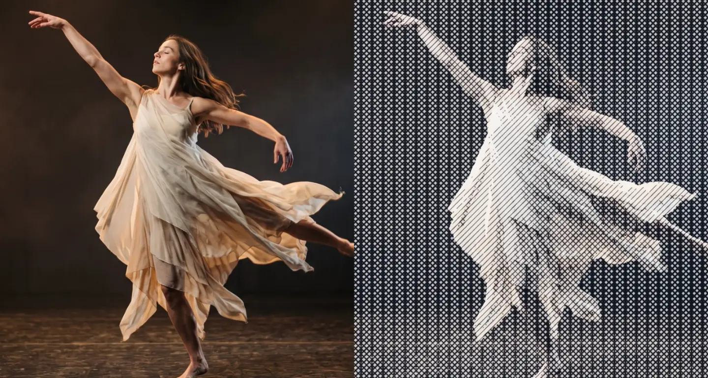
Use it for: a scene that turns into a drawing · an old engraving or etching for a memory or a document · a graphic texture on a gauze in which the figure still reads.
- Line Spacing – how fine the drawing is.
- Line Weight – how heavy the lines get in the shadows.
- Ink and Paper – the two colours of the drawing.
Tip: keyframe Amount from 0 to 1 to let the drawing grow over the picture on a cue, and back to 0 to let the picture return.
Presets
Section titled “Presets”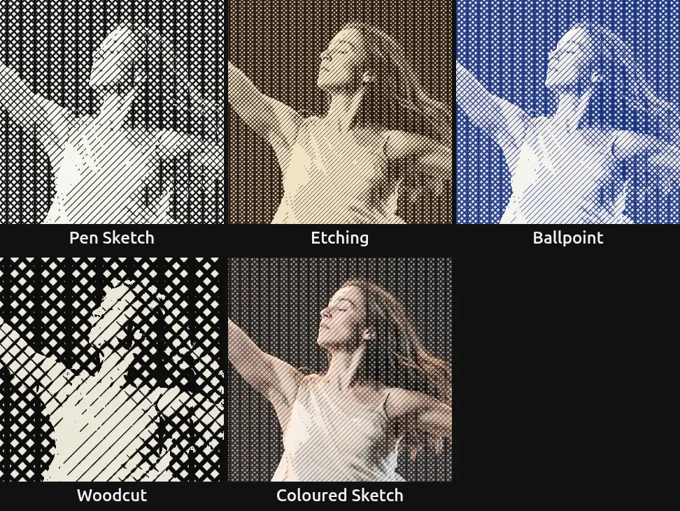
Pick one in the Preset row of the effect card. It sets all controls at once, in one undo step, and the row then shows its name until you change something. A control with keyframes keeps them, and the card says so.
Pen Sketch – black pen lines on white that thicken a little in the dark parts: a quick drawing in a sketchbook. The dark parts become a grey net with open paper between the lines, so the figure stays light and airy.
Etching – fine, heavy lines of brown ink on cream, like an old copper-plate print. The shadows fill with dense crossing strokes while the light stays clean: strong for a memory or a historical scene.
Ballpoint – blue ballpoint on white, with a trace of the picture’s own colours under the lines. A private, notebook feeling: letters, diaries, a drawing in the margin.
Woodcut – wide, bold strokes in black on off-white that swell in the shadows and keep a line of paper between them. The figure turns into a graphic print that still reads from the back of a large hall.
Coloured Sketch – fine hatching over the picture’s own colours, half and half: the picture stays and a drawing lies over it. The quietest preset.
Controls
Section titled “Controls”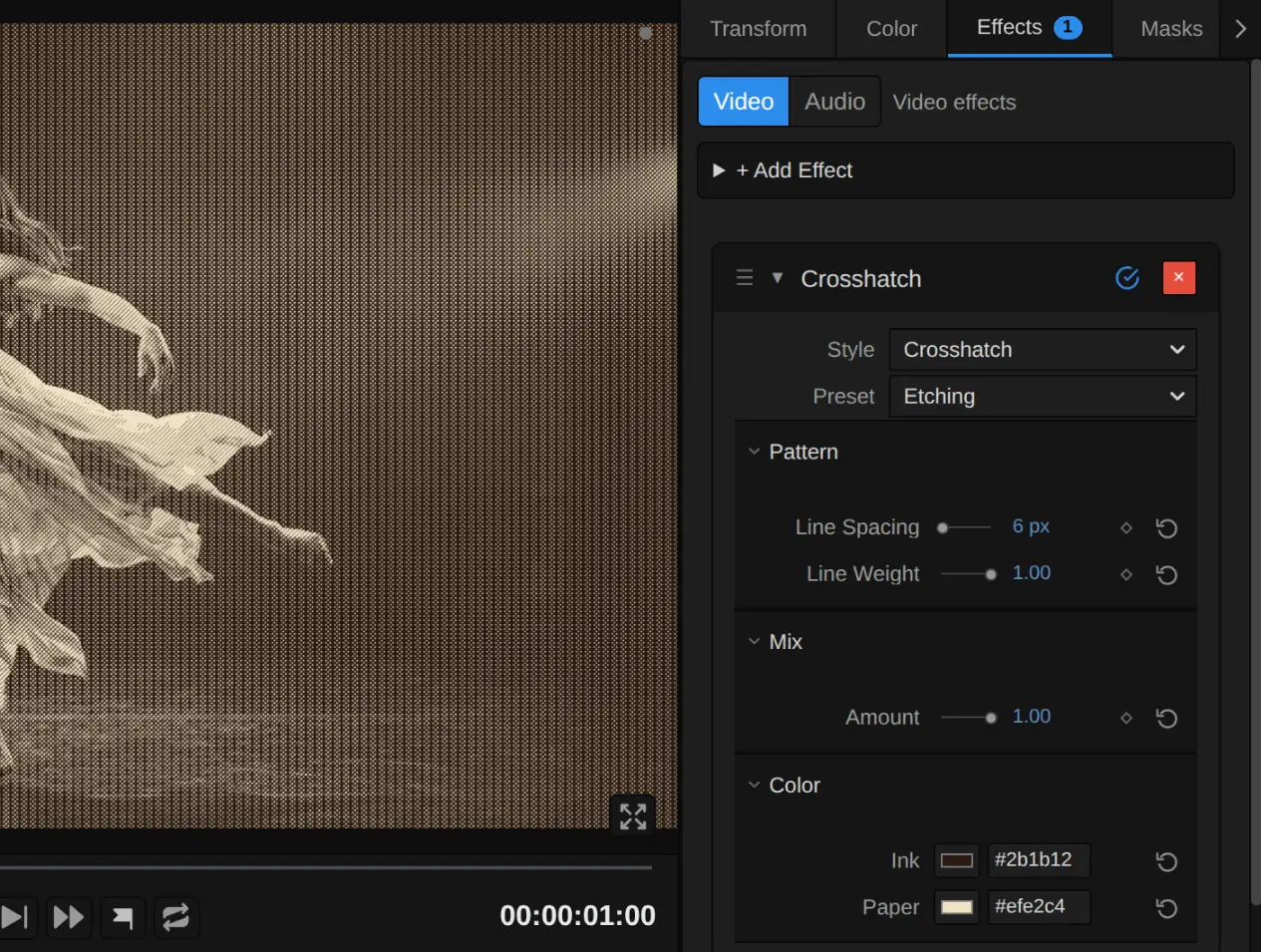
Preset – sets every control at once to one of the five starting points above.
Style – switches to another look of the same engine, for example Halftone, Vector Engraving or Contour Map. Line Spacing, Amount, Ink and Paper keep the values and keyframes you set in looks that have the same control, also under another name (Halftone’s Dot Size). A control that means something else in the new look starts at that look’s default, and the row under the menu says so: Contour Map’s Band Density counts bands, and Drift Lines’ Drift is a slide, not a mix. Line Weight carries over to and from Vector Engraving, where it does the same; Vector Engraving’s Angle has no counterpart here. Undo brings the old value back.
Pattern
Section titled “Pattern”Line Spacing – how far apart the lines sit, and so how fine the drawing is. 4–8 px gives a fine engraving that reads as a photo from a few metres away, 14 a clear pen drawing, 30 and more bold strokes like a woodcut; detail smaller than the spacing disappears. The upright lines of the darkest layer sit twice as far apart. It counts pixels of a 1080p picture, so a 4K export shows the same drawing as the preview, only sharper. Below 2 px (from keyframes or a tool) it renders 2 px, and the card says so. 2 to 80 px, default 14 px.
Line Weight – how heavy the lines get in the shadows. At 0 every line keeps one thin, even width, as in a quick pen sketch, and black stays a grey net; 0.5 thickens the strokes in the dark parts; at 1 each line starts as a hairline where its layer begins and swells until the deepest shadows are dense ink with thin lines of paper still between the strokes, like an etching. Values outside 0 to 1 (from keyframes or a tool) render as 0 or 1, and the card says so. 0 to 1, default 0.6.
Amount – how much of the drawing covers the picture. At 1 there are only ink and paper; 0.5 lays the lines over the picture’s own colours, like a coloured drawing; 0 switches the drawing off. Keyframe it to let the drawing appear on a cue. 0 to 1, default 0.75.
Ink – the colour of the lines. Black or a dark brown reads like pen and etching ink, a deep blue like ballpoint. With an ink lighter than the paper the drawing turns into a negative: the dark parts fill with light lines. It takes a colour, default #111827.
Paper – the colour between the lines, which fills the light parts of the picture. A warm cream looks like old paper, pure white like a sketchbook, a pale grey like newsprint. It takes a colour, default #f8fafc.
Node setup
Section titled “Node setup”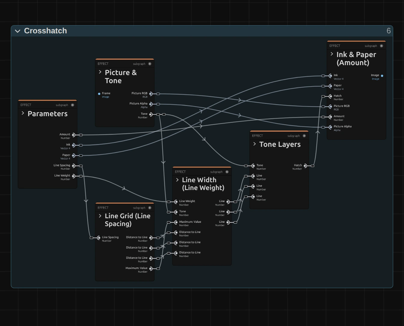
Crosshatch works in five stages, one folder each in the Nodes tab: Line Grid lays three sets of parallel lines over the frame, Picture & Tone reads the picture and its brightness, Line Width works out how wide each line is drawn at that brightness, Tone Layers lets a set of lines through only where the picture is dark enough, and Ink & Paper colours the result and mixes it with the picture. Click a folder’s header to open it; the sections below show what is inside. Crosshatch is one look of the pattern engine that the Lines & Engraving looks share; its Style menu switches between them.
Line Grid
Section titled “Line Grid”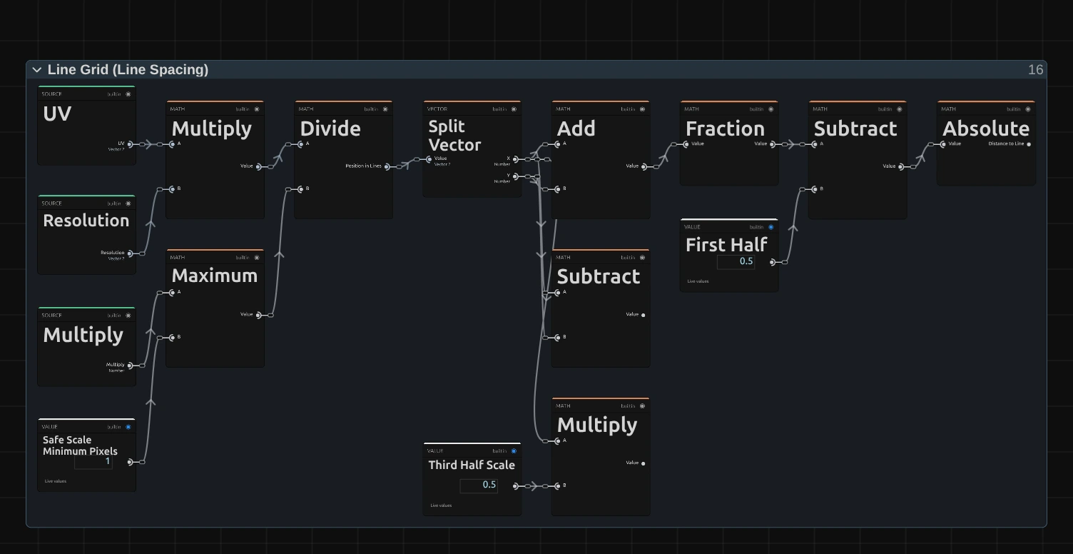
Maximum – the line spacing in pixels of this frame: Line Spacing times the frame’s size compared with 1080p (the Multiply card), and never less than one pixel.
Divide – the pixel’s place (UV times Resolution) divided by that spacing: its position counted in line spacings. Split Vector hands on the part across (x) and the part down (y).
Subtract – x minus y. Together with Add (x plus y) and Multiply (x times Third Half Scale, 0.5) it gives the three line directions: the first set rises to the right, the second falls, the third stands upright at twice the spacing.
Absolute – Fraction keeps what is after the point and Subtract takes First Half (0.5) off, so the line runs where the result is 0. Absolute turns it into the distance to that line, from 0 on the line to 0.5 midway to the next. The picture shows the first set; the other two are built the same way.
Picture & Tone
Section titled “Picture & Tone”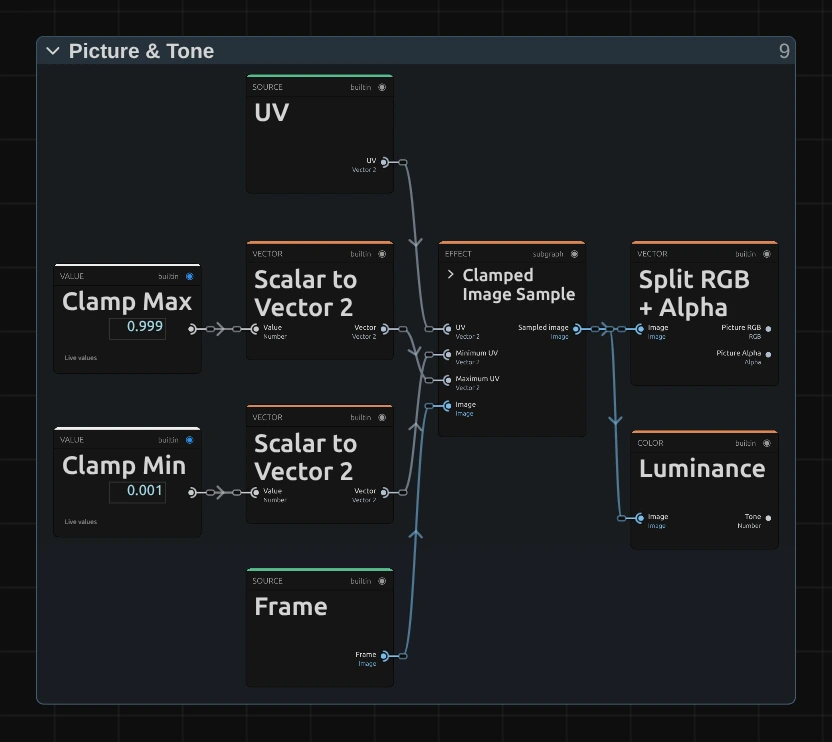
Clamped Image Sample – reads the input picture at the pixel, kept just inside the frame (Clamp Min 0.001 and Clamp Max 0.999, as a share of the frame). It holds a small node setup of its own; its › opens it.
Split RGB + Alpha – splits the picture into its colour, which Amount mixes back in at the end, and its transparency, which the result keeps.
Luminance – the brightness of the pixel, from 0 for black to 1 for white. It decides which line sets appear and how wide they are drawn.
Line Width
Section titled “Line Width”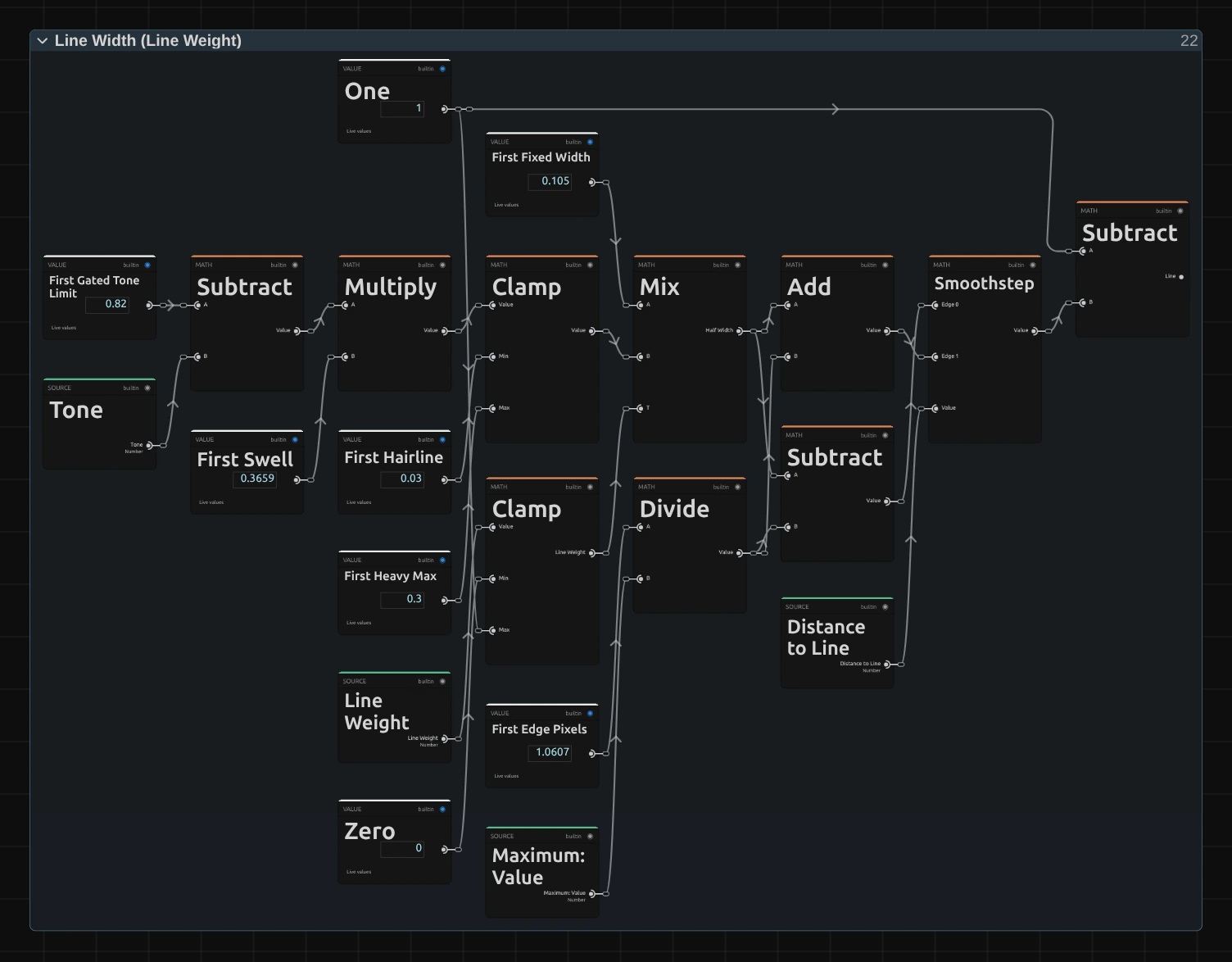
Multiply – the layer’s tone limit (First Gated Tone Limit, 0.82) minus the pixel’s Tone (Subtract), times First Swell 0.366: how much darker the pixel is than the point where this line set begins, scaled so that black gives 0.3.
Clamp – keeps that between First Hairline 0.03 and First Heavy Max 0.3: the half width a line has at Line Weight 1, a hairline where the set begins and 0.3 of the spacing in black, so a gap of paper of about 1.7 px stays between the lines even at 6 px spacing and the shadows read as strokes, not as a dot screen.
Mix – blends First Fixed Width 0.105, the even width of Line Weight 0, with that heavy width, by Line Weight (the other Clamp keeps it between 0 and 1): the half width of the line at this pixel.
Divide – First Edge Pixels (0.75 px across the line, 1.06 in the diagonal’s own units) divided by the line spacing in pixels (Maximum): First Soft, about one pixel of soft edge at any spacing.
Smoothstep – compares the Distance to Line with that half width, softened on each side by First Soft (Subtract and Add): 0 inside the line, 1 outside, with a soft edge. Subtract from One turns it round, so Line is 1 on the line.
Remix: open the Constants folder and set First Swell from 0.366 to 1: the rising lines reach their full weight already in the mid-tones, and the drawing turns darker and bolder.
Tone Layers
Section titled “Tone Layers”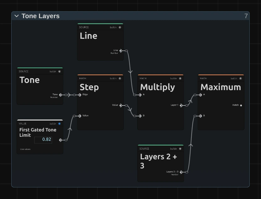
Step – 1 where the pixel’s Tone is at or below First Gated Tone Limit (0.82), else 0. The other two sets begin at 0.58 and 0.32: the light parts get one line direction, the mid-tones two, the shadows all three.
Multiply – the Line times that step: the first set of lines, only where the picture is dark enough (Layer 1).
Maximum – the stronger of Layer 1 and Layers 2 + 3 (another Maximum joins those two): the Hatch, 1 on any line and 0 on bare paper.
Ink & Paper
Section titled “Ink & Paper”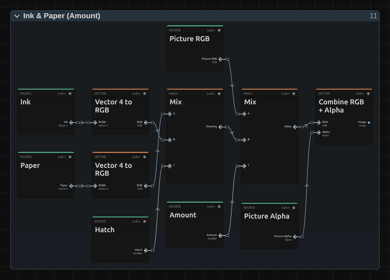
Mix – Paper where the Hatch is 0, Ink where it is 1, in between on the soft edges: the drawing. The second Mix blends the picture’s own colour (Picture RGB) with the drawing by Amount.
Combine RGB + Alpha – joins the result with the picture’s own transparency (Picture Alpha), so a cut-out figure keeps its outline.
Technical details
Section titled “Technical details”- Size. Line Spacing counts pixels of a frame whose shorter side is 1080: a 4K export, a portrait 1080 × 1920 frame, a lower Preview Quality and the thumbnails show the same drawing. A spacing is never thinner than one pixel of the frame; below 2 px Line Spacing renders as 2. The card says when either happens.
- Lines. Every line edge is about one pixel of the output frame soft, at a fine and a wide spacing alike, so diagonals draw no stair-steps and wide strokes stay crisp. Each pixel reads its own brightness: the three sets begin at brightness 0.82, 0.58 and 0.32. The line grid itself stays still on moving footage, but in grainy dark areas the line widths follow the grain and flicker a little; Line Weight 0 or a light blur before the effect calms them.
- Transparency. The drawing keeps the picture’s transparency, so a cut-out figure keeps clean edges and transparent parts stay transparent. The preview and the export match; the look does not move by itself.
- Saved projects. A Crosshatch saved before Line Weight existed opens with Line Weight 0 and keeps its thin, even lines. One bug fix changes how it looks: the line edges were a share of the spacing soft (hard stair-steps at 6 px, about 5 px of blur at 80 px) and are now one pixel soft. Line Spacing was called Scale; the value is the same.
- More: Effect system · Node Catalog · Styles and presets.