
Contrast
Adds punch: deeper shadows and brighter highlights on a soft S-curve that never burns out. Turned down, it lays a faded, misty veil over the picture.
Group: Color & Tone · How to add an effect
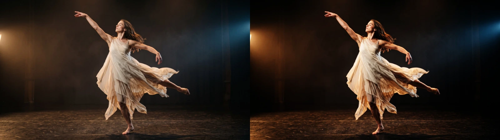
Use it for: flat or hazy footage · a projection that has to read from the back row · a faded, old-print look · a scene seen through a gauze.
- Amount – above 1 punchier, below 1 flatter.
Tip: strong Contrast makes warm light more orange. If skin tones go too far, lower Saturation a little after it. To lift or lower the picture as a whole, use Brightness instead: Contrast always pivots around mid-grey.
Presets
Section titled “Presets”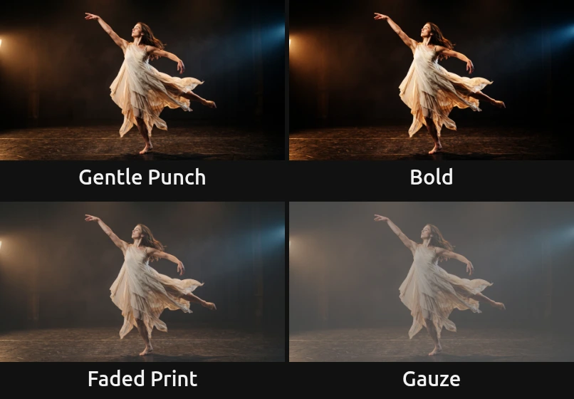
Pick one in the Preset row of the effect card. It sets Amount in one undo step, and the row then shows its name until you change the value. A keyframed Amount keeps its keyframes, and the card says so.
Gentle Punch – a little more depth for flat or slightly hazy footage. It looks like better footage, not like an effect.
Bold – the haze and the set sink into black while costumes and skin step forward. For a projection that has to hold up against stage light.
Faded Print – blacks lift into a soft brown-grey and whites calm down, like an old photograph or a memory scene.
Gauze – flat and pale, as if the scene were seen through a scrim or thick haze. Keyframe Amount from here up to 1 to let the picture come out of the mist.
Controls
Section titled “Controls”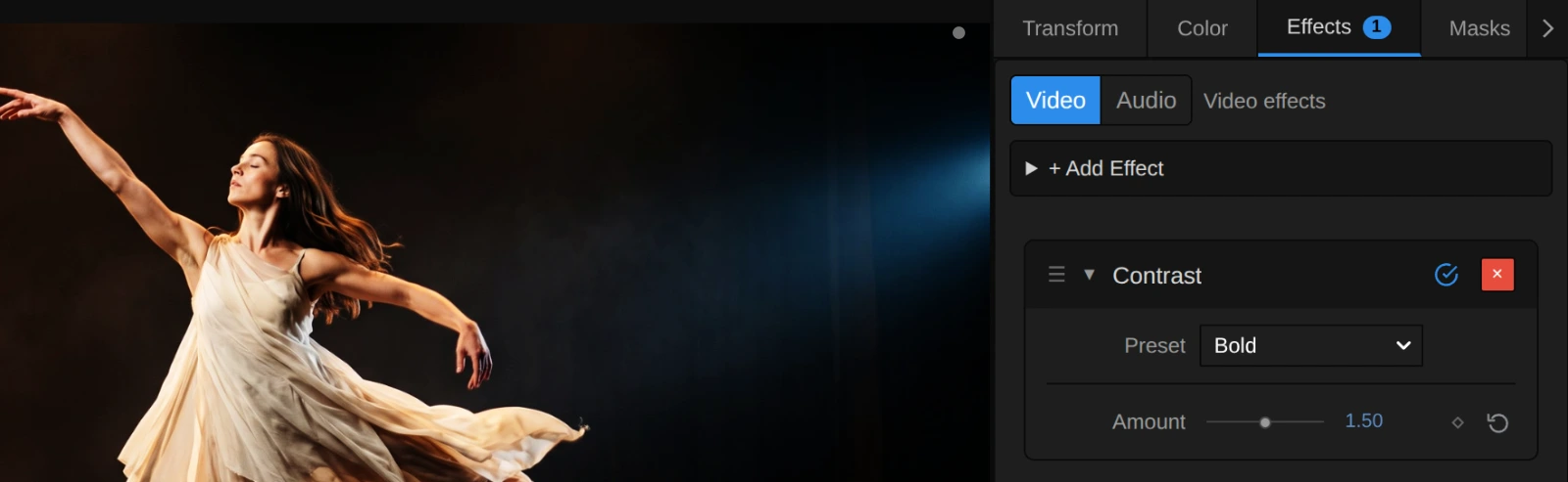
Preset – one of the four starting points above; it sets Amount.
Amount – how steep the tones are around mid-grey. 1 leaves the picture as it is. Above 1 shadows get deeper and highlights brighter on a soft S-curve: black and white stay where they are, so bright details roll off instead of burning out. 1.2 adds depth, 1.5 is bold, 2 and more turns the picture graphic. Below 1 everything moves evenly toward mid-grey: blacks lift, whites soften, 0.75 is a faded print and 0 plain grey. Strong values also make colours stronger and warm light more orange. 0 to 3, default 1. In the number field you can type up to 10, for a hard, almost posterised cut where each colour channel snaps toward dark or bright.
Node setup
Section titled “Node setup”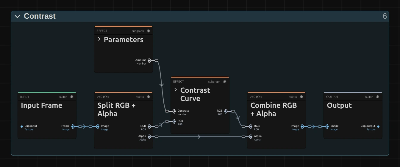
Contrast works in two stages (Color & Tone shows the shape all colour effects share): Parameters keeps Amount within its range, and Contrast Curve does the work. It is a shared block from Reusable Nodes, so the same curve can be dropped into any graph. Inside it, one half fades the picture below 1 and the other bends it into an S above 1; only one of them acts at a time, the other passes the picture on unchanged. Split RGB + Alpha takes the transparency aside first and Combine RGB + Alpha puts it back untouched. Click a folder’s header to open it; the sections below show what is inside.
Parameters
Section titled “Parameters”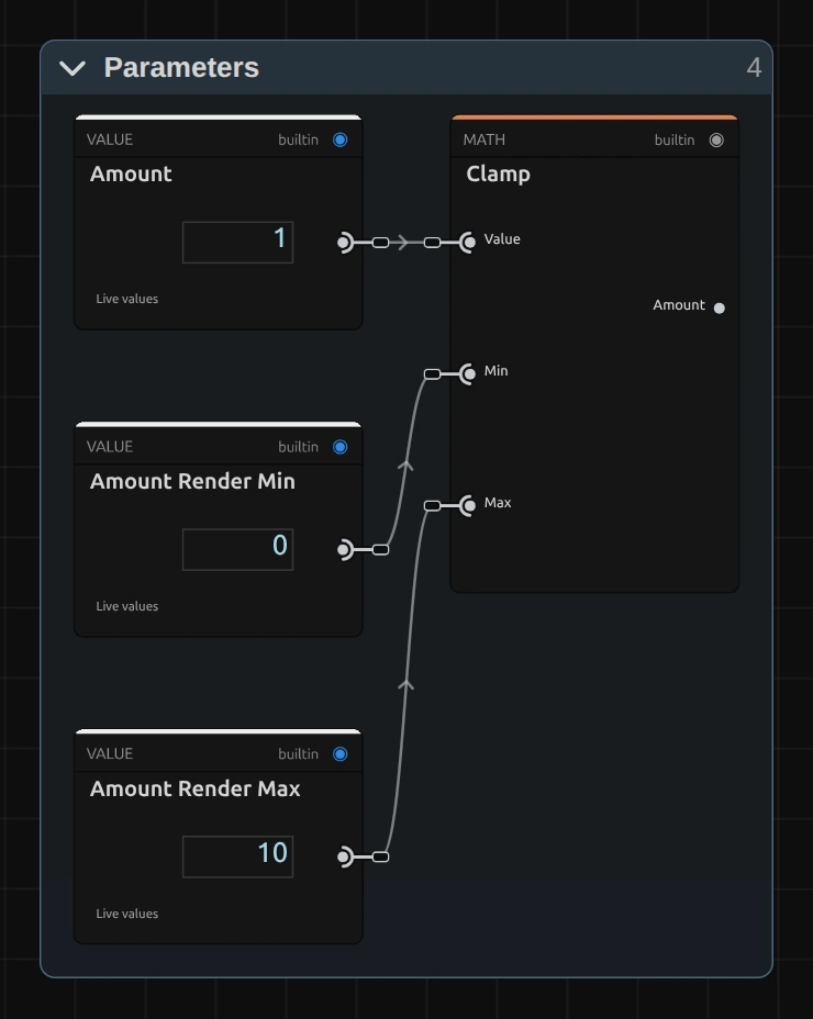
Clamp – keeps Amount between 0 and 10, the values in Amount Render Min and Amount Render Max. A keyframe, a node or the AI agent may send more; the picture then uses the limit, and the card and the tool result say so.
Contrast Curve: the fade below 1
Section titled “Contrast Curve: the fade below 1”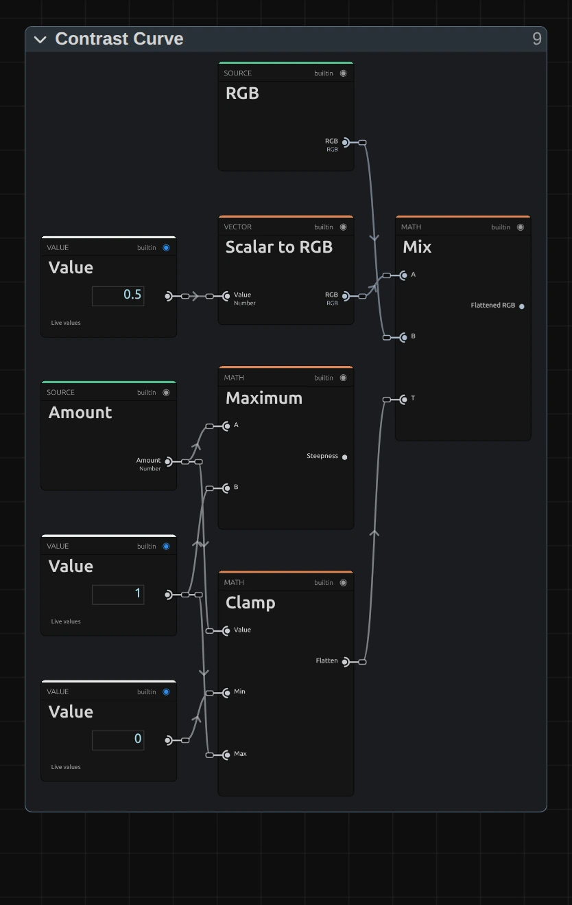
Clamp – keeps Amount between 0 and 1: how much of the picture’s spread the fade keeps. From Amount 1 up it stays 1, so the fade does nothing. The 0 matters only when you drive the block yourself in an Image graph: a value below 0 gives plain grey, not a negative.
Mix – blends mid-grey (the Value 0.5) with the picture by the Flatten share: 1 is the picture as it is, 0.5 halfway to grey, 0 plain grey. Every tone moves the same way, so the shadows get no extra push and their noise stays as fine as it was. The result is the Flattened RGB.
Remix: set the 0.5 to 0.2 and the faded picture sinks toward a dark grey instead, like a dim old film; 0.8 makes it a pale, overexposed fade.
Contrast Curve: the S-curve from 1 up
Section titled “Contrast Curve: the S-curve from 1 up”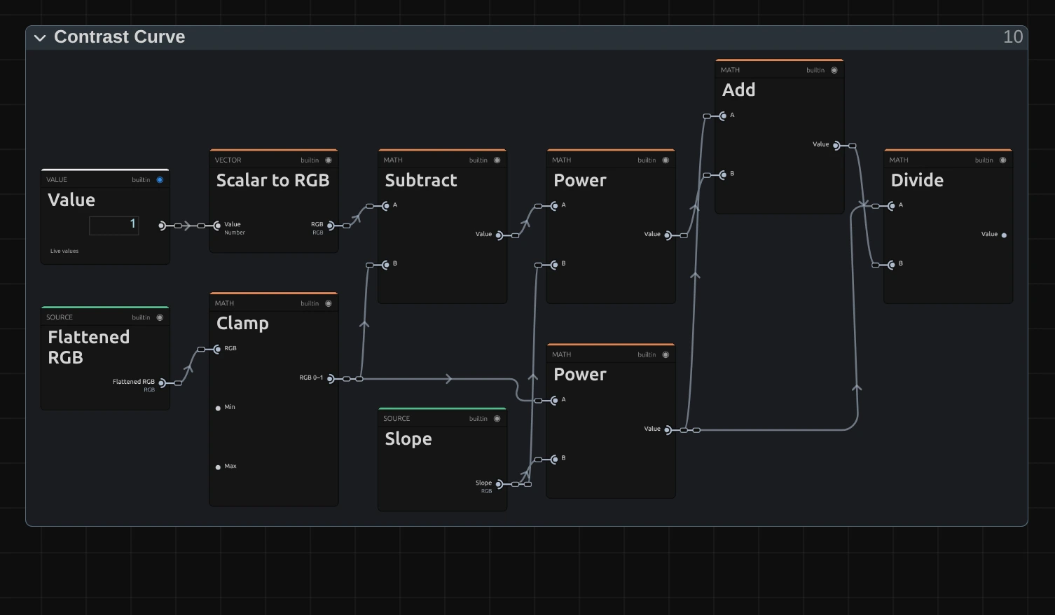
Power – there are two, one per side. The lower one raises each colour channel to the Slope. The Slope is the Steepness from the first half, where a Maximum takes the larger of Amount and 1: below Amount 1 it stays 1 and the curve does nothing. A higher Slope pushes dark tones down. The upper one does the same for the channel’s distance to white (Subtract: 1 minus the channel): a higher Slope pushes bright tones up.
Divide – divides the shadow side by the sum of both sides (Add). Black stays 0, white stays 1, mid-grey stays mid-grey, and the tones in between bend into an S. That is why Contrast never clips.
Remix: to deepen only the shadows, drag a cable from the Scalar to RGB of the Value 1 into input B of the upper Power, in place of the Slope. Dark and middle tones get darker, the highlights stay almost as they are.
Technical details
Section titled “Technical details”- Formula. From Amount 1 up
y = x^c / (x^c + (1 − x)^c)on each colour channel, withc= Amount; below 1y = 0.5 + (x − 0.5) · c. Either way the slope at mid-grey is the Amount. - Range. The slider covers 0 to 3; typed values, keyframes and nodes render up to 10. Beyond that the picture uses the limit, and the inspector and the tool result say so.
- Colour. It works per channel, so strong values also raise the saturation and push warm lights toward red-orange; flattening softens colours in the same way.
- Transparency. Only the colour is changed; the transparency passes through untouched.
- Saved projects. Before this fix Contrast ran its S-curve below 1 too. That stretched the darkest shadows so far that their grain turned into coloured blotches. A saved Contrast with that recipe now fades evenly below 1, and so does a Contrast Curve block placed in your own graph; from 1 up both look exactly as before. A saved Contrast whose folders you bypassed, or whose curve you edited inside the block, keeps what you built; an edit outside the block (in Parameters, say) keeps that edit, and the block itself gets the even fade.
- What all colour effects share (8-bit range, saved projects, adjustment layers): Color & Tone. Formulas: Effect system; blocks: Node Catalog · Styles and presets.