
Paper Print
Prints the picture in one ink on paper, made of a fine grain, like an old mezzotint or a photo in a book. For memories, archives and letters on stage, and one-colour posters.
Group: Print & Halftone · How to add an effect
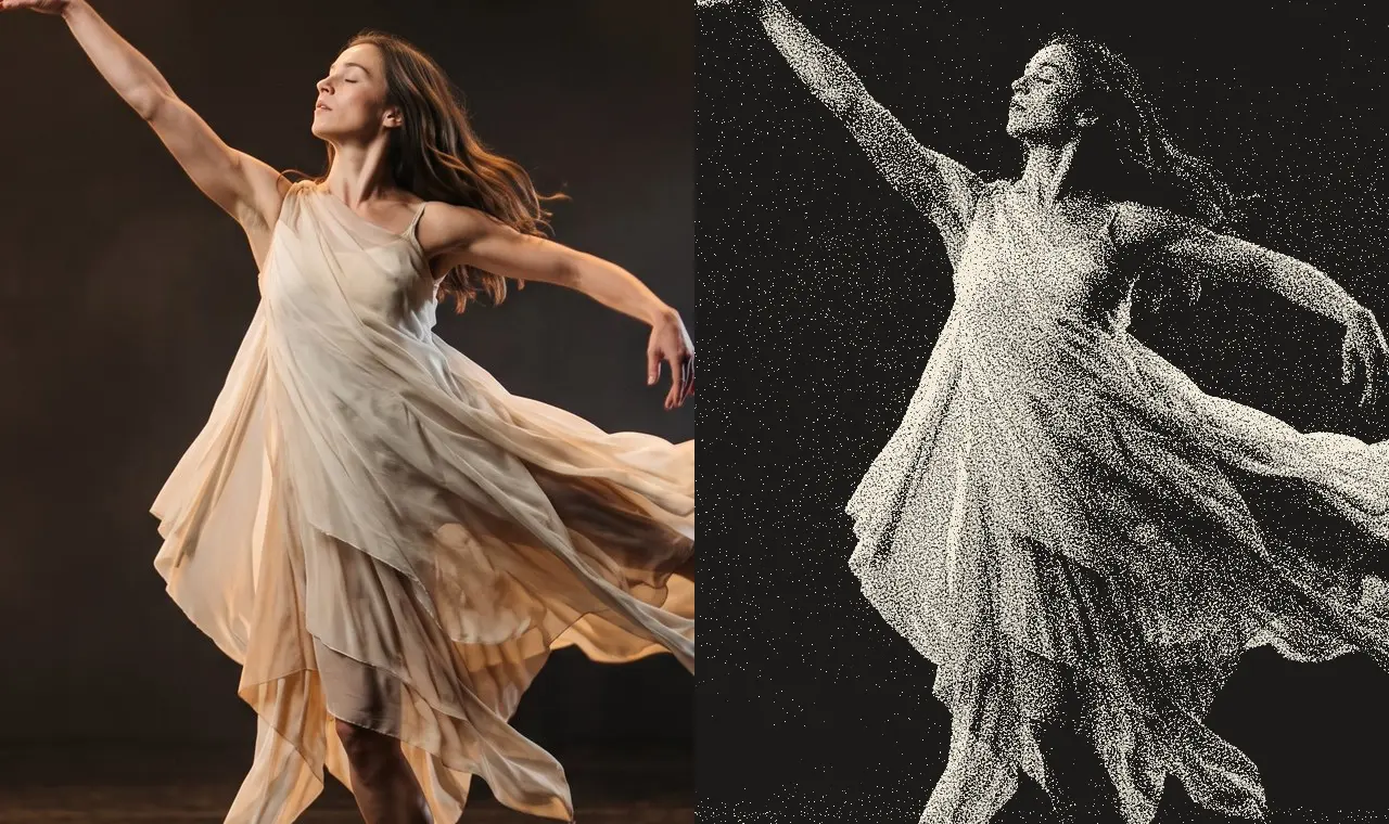
Use it for: an old photograph or a memory · archives, letters and documents on a projection · a poster in one colour.
- Grain Size – how coarse the grain is.
- Texture – how much of the paper shows through the ink.
- Ink – the colour that prints.
- Paper – the colour it prints on.
Tip: pick a light Ink on a dark Paper (the Blueprint preset) and only the light parts of the picture are printed: a dark stage stays clean paper around the lit figure. For dots in a regular grid use Halftone; for two inks, Riso.
Presets
Section titled “Presets”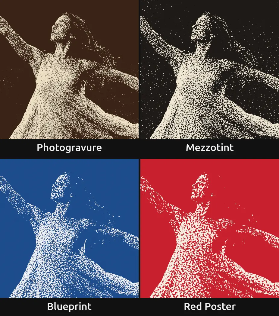
Pick one in the Preset row of the effect card. It sets all controls at once, in one undo step, and the row then shows its name until you change something. A control with keyframes keeps them, and the card says so.
Photogravure – a fine grain in brown-black on warm, smooth paper, like an old photogravure in a book. The quietest preset: the stage stays an even brown and from a few metres away the figure reads as a soft sepia photo.
Mezzotint – warm black on cream with a clearly visible grain, like the velvety grain of a mezzotint. Made for portraits and memories.
Blueprint – white ink on deep blue paper. The light parts of the picture are printed, so a dark stage turns into clean blue around the lit figure.
Red Poster – signal red on off-white with a medium grain on smooth paper, like a screen-printed poster. Loud and graphic: the figure stands out of the red as a clean, grainy silhouette.
Controls
Section titled “Controls”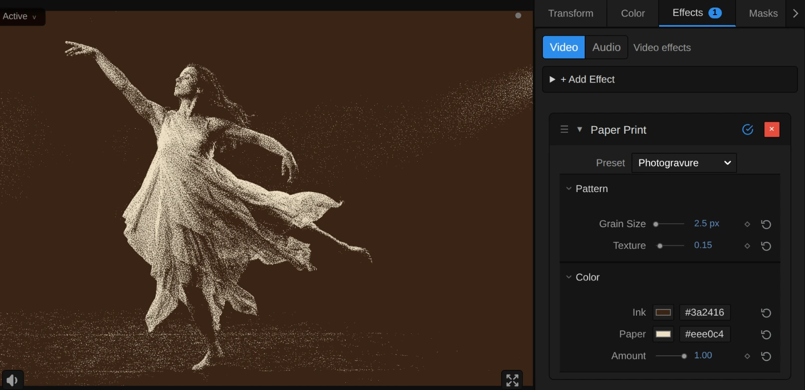
Style – switches to another look of the same engine, for example Halftone, Dithering or Riso. A control you changed keeps its value and keyframes when the new look has the same control, also under another name (Grain Size is Halftone’s Dot Size); the others start at the new look’s defaults. Texture is Paper Print’s own: it stays for a switch back.
Pattern
Section titled “Pattern”Grain Size – how large one grain is. 1–2 px gives a fine grain that reads as a photo from a few metres away, 4–6 px a clearly visible grain like a mezzotint, 10 px and more coarse specks for a poster; the coarser the grain, the less detail survives. It counts pixels of a 1080p picture, so a 4K export shows the same grain, only sharper. A grain is never smaller than one pixel of the frame, and the card says when it renders larger. 1 to 80 px, default 2 px.
Texture – how much of the paper’s surface shows. Real paper has fine bumps, and the ink does not reach their valleys: tiny specks of paper appear in the mid tones, and the paper itself looks a little uneven. The specks fade out the more ink a part needs, so a black stage stays solid ink and white parts never get ink. At 0 the ink lies flat and the print keeps the picture’s brightness exactly; 0.15 is a quiet paper; the default 0.5 a clearly felt one; at 1 the mid tones get slightly lighter. Below 0 it renders 0, and the card says so. 0 to 1, default 0.5.
Ink – the colour that prints. It covers the dark parts of the picture, and where the picture is as dark as the ink, the ink is solid. Dark inks give a classic print; brown, blue or red tint the whole picture. A light ink on dark paper prints the light parts instead. If Ink and Paper are about equally bright, the picture cannot show, and the card says so. It takes a colour, default #1c1a18.
Paper – the colour the ink prints on, which fills the light parts of the picture. A warm cream looks like real paper, a deep colour like a coloured sheet. It takes a colour, default #f3ecdc.
Amount – how much of the print covers the original. At 1 there is only ink and paper; 0.5 lays the grain softly over the picture’s own colours; 0 switches it off. Keyframe it to let a photo turn into a print on a cue. 0 to 1, default 1.
Node setup
Section titled “Node setup”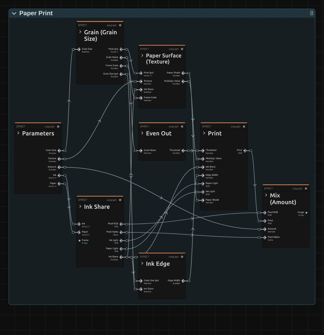
Paper Print works in seven stages, one folder each in the Nodes tab: Grain lays a smooth grain over the frame, Even Out turns it into a threshold that is spread evenly between 0 and 1, Ink Share works out how much ink each pixel needs to look as bright as the picture, Paper Surface adds the paper’s bumps, Ink Edge works out how soft the edge of the ink is, Print puts ink wherever the share is above the threshold, and Mix (Amount) lays the print over the picture. Click a folder’s header to open it; the sections below show what is inside.
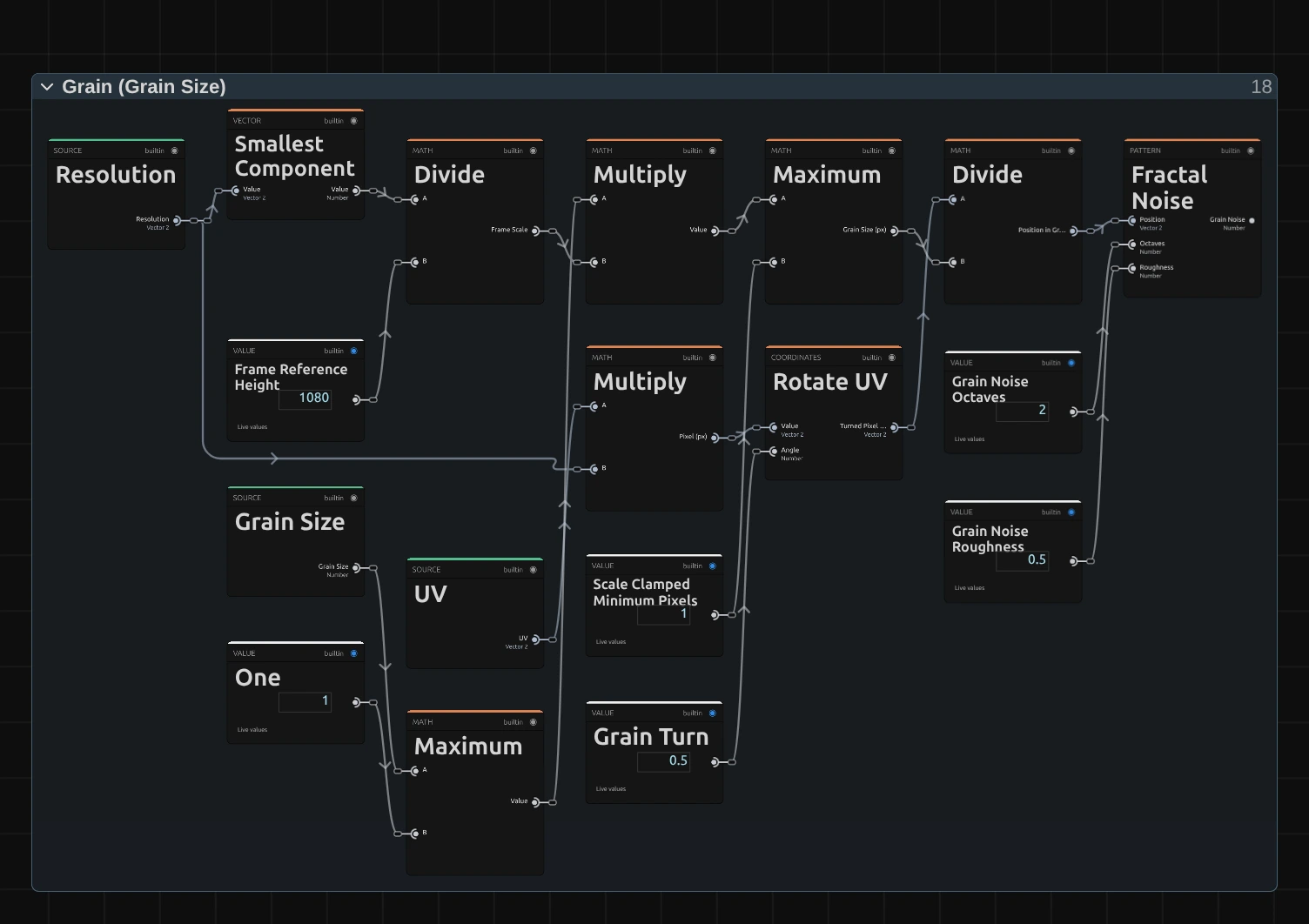
Divide – the shorter side of the frame (Smallest Component) divided by 1080: how much larger or smaller this frame is than a 1080p one. It makes Grain Size look the same on a 4K export, a portrait frame and a thumbnail.
Maximum – Grain Size times that scale, and never less than one pixel: the size of one grain in pixels of this frame. The Maximum to its left keeps Grain Size at 1 or more.
Rotate UV – turns the pixel’s position by the Grain Turn of 0.5 (about 29°). The grain no longer lines up with the pixel grid, so neighbouring pixels read different parts of a grain; with whole-pixel grains in line with the grid, every pixel would read the same few spots and the print would come out a little too dark or too light.
Fractal Noise – a smooth noise, one blob per grain, with a second, finer layer on top (two octaves, Roughness 0.5): the grain itself. It gives every pixel a value around 0.5.
Remix: open the Constants folder and set Grain Noise Octaves from 2 to 1: the grain turns into smooth, round blobs, like the reticulated grain of an old film. The tones shift a little, because Even Out is measured for two octaves.
Even Out
Section titled “Even Out”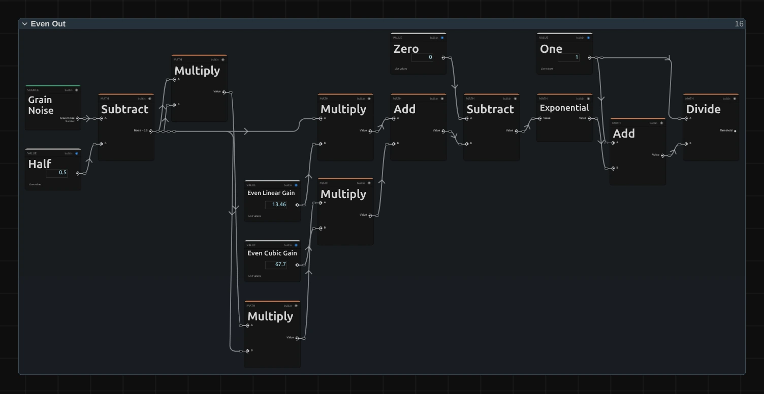
Subtract – the grain minus 0.5, so it swings around zero. Multiply makes its square and cube.
Add – the grain times 13.46 plus its cube times 67.7. These two numbers were measured from the noise: they describe how often it takes each value.
Exponential – e to the minus that value: the heart of an S-shaped curve.
Divide – 1 divided by 1 plus the Exponential: the S-curve itself, from 0 to 1. It turns the noise, which mostly stays near its middle, into a threshold that takes every value between 0 and 1 equally often. That is what keeps the tones right: a pixel that needs 30 % ink gets ink on exactly 30 % of the grain.
Ink Share
Section titled “Ink Share”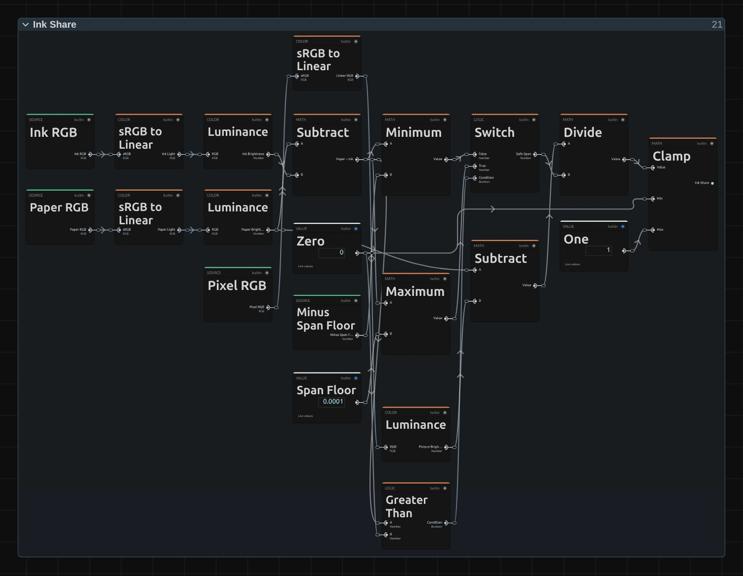
Subtract – the paper’s brightness minus the picture’s: how much light the picture lacks compared with the bare paper. Each brightness comes from sRGB to Linear and Luminance, so it is measured as light, the way a screen adds it up.
Switch – the gap between Paper and Ink (Subtract above), kept away from zero: at least 0.0001 on the side it is on. Equally bright Ink and Paper would otherwise divide by zero.
Divide – the missing light divided by that gap: the share of ink this pixel needs. Ink on that share and paper on the rest have exactly the picture’s brightness.
Clamp – keeps the share between 0 (bare paper) and 1 (solid ink). Light ink on dark paper gives a negative gap and works the other way round.
Paper Surface
Section titled “Paper Surface”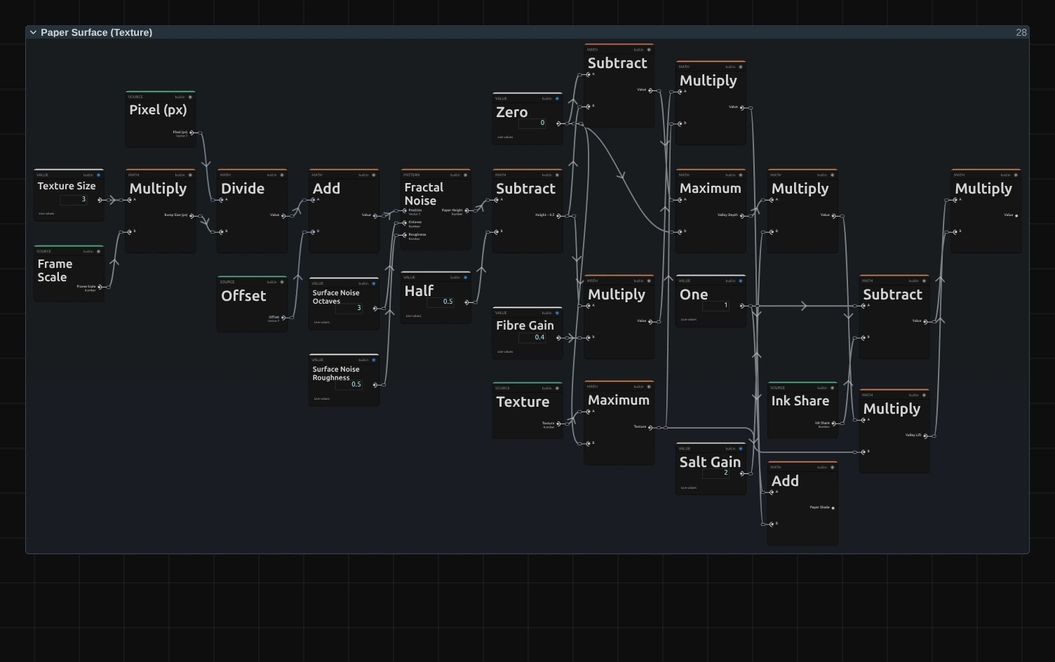
Fractal Noise – the height of the paper: fine bumps 3 pixels of a 1080p frame across, in three layers. It is moved by an Offset, so it never repeats the grain.
Multiply – a Maximum first gives how deep a point lies below the middle height (0 on the bumps, larger in the valleys); this Multiply takes it times 2 (Salt Gain).
Multiply – that times Texture (kept at 0 or more by the Maximum beside it): the Valley Lift, how much the grain’s threshold is lifted in the valleys. Where it rises above the share, the ink misses: a speck of paper in the ink. Nothing lowers the threshold, so white paper never gets ink.
Multiply – the Valley Lift times one minus the Ink Share: the specks fade out where the picture needs much ink. Mid tones show the paper’s bumps, a dark stage stays solid ink instead of filling with white specks.
Add – 1 plus the height times 0.4 times Texture: the paper’s shade, a little darker in the valleys and lighter on the bumps.
Remix: open the Constants folder and set Texture Size from 3 to 12: the specks grow into blotches, like ink on a coarse, handmade paper.
Ink Edge
Section titled “Ink Edge”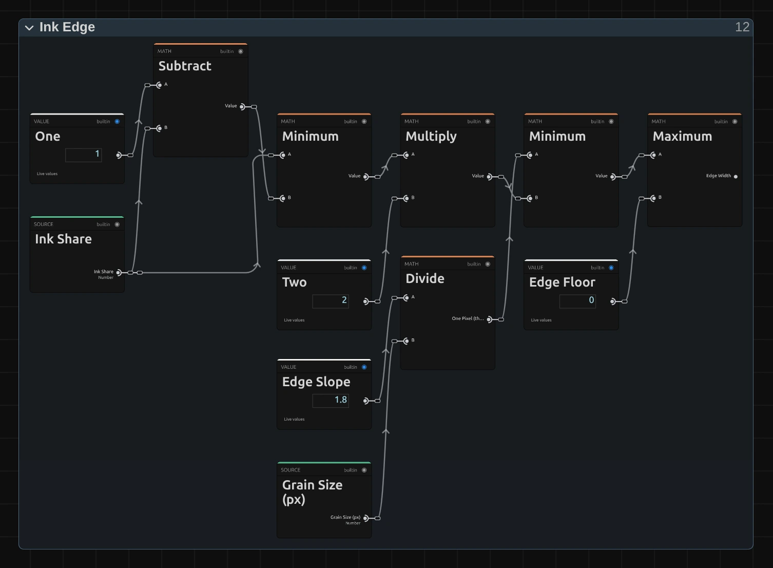
Divide – 1.8 divided by the grain size in pixels: how far the threshold changes across one pixel at the edge of a grain (1.8 per grain was measured). An edge that wide is one pixel soft at every Grain Size: sharp, but not jagged.
Multiply – the share’s distance to the nearest end, 0 or 1, times 2. The Minimum after it takes the smaller of the two, so near pure white and pure black the edge gets harder: white stays clean paper, black solid ink, and an area still gets exactly its share of ink.
Maximum – keeps the edge width above a tiny floor, so the next stage never divides by zero.
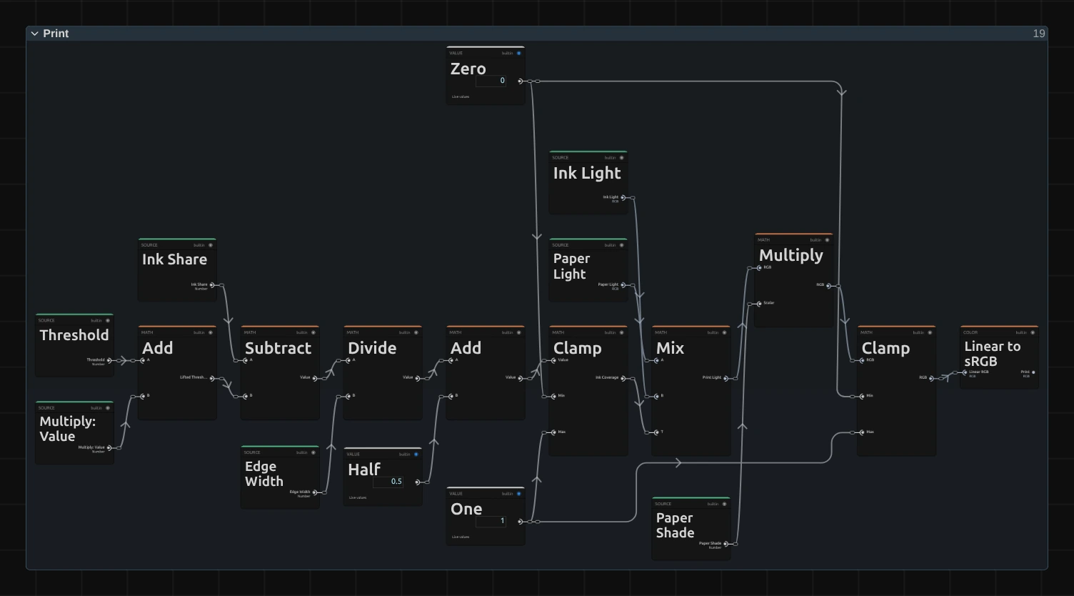
Add – the grain’s threshold plus the valley lift from Paper Surface.
Divide – the share minus that threshold, divided by the edge width: how far above the threshold the share lies, in edge widths.
Clamp – plus 0.5 and kept between 0 and 1: the ink’s coverage of this pixel. 1 where the share is clearly above the threshold, 0 where it is clearly below, and in between along the one-pixel edge.
Mix – the ink over the paper by that coverage, both as light, so a fine grain blends to the right brightness.
Multiply – darkens or lightens the result by the paper’s shade. A Clamp and Linear to sRGB turn it back into a colour.
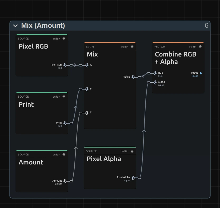
Mix – lays the print over the pixel’s own colour by Amount: at 1 only the print, at 0 the picture.
Combine RGB + Alpha – joins the colour with the picture’s own alpha, so a cut-out figure keeps its edges and the empty parts stay empty.
Technical details
Section titled “Technical details”- Size. Grain Size counts pixels of a frame whose shorter side is 1080: a 4K export, a portrait 1080 × 1920 frame, a lower Preview Quality and the thumbnails show the same grain. A grain is never smaller than one pixel of the frame being drawn, so a fine grain can come out coarser in a preview at 1/4 quality than in the export (Grain Size 2 at 1/4 quality is half a preview pixel and draws a whole one, twice as coarse as the export); below 1 px Grain Size renders as 1. The card says when either happens, for the preview as well as the export. The paper’s bumps are 3 pixels of a 1080p frame.
- Tone. The share of ink is worked out in linear light. Over an area the print keeps the picture’s brightness within 2 % at Texture 0; Texture lifts the mid tones a little (the most at 1), and the lift fades out towards full ink. Pure white prints clean paper and pure black solid ink at every Texture.
- Time. Paper Print does not move: the grain stays in place on the frame, so moving footage slides under it like a picture under a screen. A paused picture needs no extra rendering.
- Transparency. Every pixel is printed by itself and keeps its own alpha, so cut-out edges get no dark rim.
- Saved projects. A Paper Print saved before Texture keeps its earlier look (a soft two-colour print under a blocky grain); its card hides Texture and says so. Values saved without Grain Size, Ink, Paper or Amount keep 18 px,
#111827,#f8fafcand 0.75. A node setup you edited keeps its own recipe. - More: Effect system · Node Catalog · Styles and presets.