
Grid Glyph
Rebuilds the picture from characters, each in its own ruled box, like a type case or a table of figures. The lines glow in the colour of their cell, so the grid lights up with the picture.
Group: Text & Glyph · How to add an effect
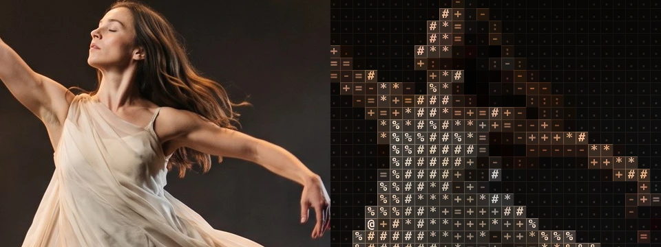
Use it for: letters, archives and print on stage · numbers, data and surveillance · a tiled wall or mosaic on a large projection.
- Cell Size – how big the boxes are.
- Line Width – how thick the lines are.
- Line Glow – how brightly they shine.
- Background – how much of the picture glows behind the characters.
Tip: on stage footage set Black Level to about 0.1: the dim stage no longer fills every box with a dot, and the figure stands clear in the grid. Keyframe Line Width from 0 to 1.5 to rule the grid over a typed picture on a cue.
Presets
Section titled “Presets”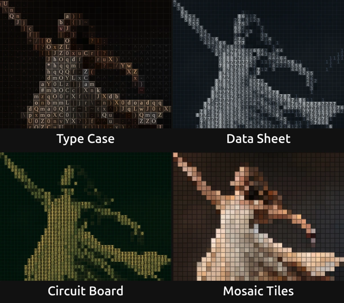
Pick one in the Preset row of the effect card. It sets all controls at once, in one undo step, and the row then shows its name until you change something. A control with keyframes keeps them, and the card says so.
Type Case – serif letters, each in its own box with a fine lit frame, like the compartments of a printer’s type case. Black Level 0.12 keeps the dark stage quiet, so the figure reads in the brightest boxes. For a world of print, archives, letters and memory.
Data Sheet – pale figures in a slate-blue table, like a spreadsheet of numbers. Its Dark is a slate blue instead of black, so the grid rules the whole frame, the empty stage too. For data, offices, a person reduced to numbers.
Circuit Board – bold gold zeros and ones in a fine grid on dark board green, like the copper traces of a circuit board. For machines, control rooms and digital worlds.
Mosaic Tiles – one full block per cell in the picture’s colour, with dark joints between them: the picture becomes a wall of square tiles. Line Glow 0.05 turns the lines into the joints. Calm and graphic; strong on large surfaces.
Controls
Section titled “Controls”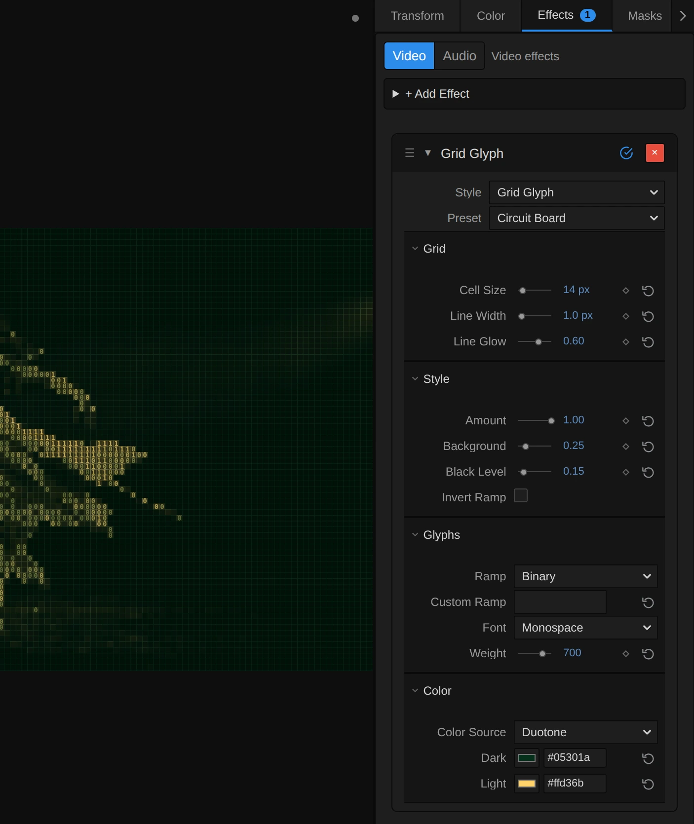
Style – switches to another look of the same engine and keeps your values and keyframes, for example ASCII, Number Field or Pixel Code. Line Width and Line Glow belong to Grid Glyph alone: other looks leave them unread, and switching back brings them back. Undo brings the old look back.
Cell Size – how big one box, and the character in it, is. 10–14 gives a fine table that reads as a picture from afar, 18 small boxed characters with a clearly visible grid, 30 and more large letters each in a box of its own, like a type case; at 72 the frame holds only 15 rows. It counts pixels of a 1080p picture, so the preview, the thumbnails and a 4K export show the same grid. 4 to 72 px, default 18 px.
Line Width – how thick the ruled lines are. 1 is a hairline, one pixel of a 1080p picture; 2–3 gives the joints of a tiled wall; 6 and more broad frames that leave only a small window for each character. At 0 no lines are ruled, and the look is plain ASCII. Every box carries its line along its top and left edge, so each border is one line. A line is at most half a box wide, so the characters never disappear: with small boxes, say Cell Size 6 and Line Width 8, the line renders as 3 px, and the card says so. Like Cell Size it counts pixels of a 1080p picture: a hairline stays a hairline at every Preview Quality and export size. 0 to 8 px, default 1 px.
Line Glow – how brightly the lines shine, in the colour of their box. At 0.4 they glow softly, so the grid lights up with the figure and fades into a dark stage; at 1 they take the full colour of the box; at 0 they become dark joints that cut through the characters, which suits full blocks (Mosaic Tiles). With Color Source on Source a line is never brighter than its box, so the grid stays dark where the picture is black. 0 to 1, default 0.4.
Amount – how much of the effect you see. At 0 the original picture, unchanged; in between, the ruled characters fade in over it. Keyframe it to type a picture in. 0 to 1, default 1.
Background – how much of the picture fills each box behind its character. At 0 characters and lines stand on a near-black ground; 0.2–0.4 lets the picture glow through, so the figure reads as a lit table; towards 1 the boxes take the full colour of their character, and characters and lines vanish into a plain mosaic. 0 to 1, default 0.2.
Black Level – the brightness up to which the picture counts as black. Everything darker becomes the first character of the ramp, the space in most ramps (with Invert Ramp the last, densest one), so a grey stage drops out and only the lit figure is typed; the rest of the picture spreads over the whole ramp, so the figure gets more different characters. The lines stay. Try 0.1–0.2 on stage footage. 0 to 0.9, default 0.
Invert Ramp – swaps the ends of the ramp: dark parts get the dense characters and bright parts the light ones, like a negative typed on paper. The colours and the lines stay. Either on or off, default off.
Glyphs
Section titled “Glyphs”Ramp – the row of characters the picture is built from, from the darkest to the brightest part. Standard (.:-=+*#%@ after a space) is classic ASCII art in boxes; Detailed uses about seventy letters and signs (Type Case); Blocks fills each box with the shading blocks ░ ▒ ▓ █; Bars with a bar that rises with brightness, like a table of level meters; Binary writes only 0 and 1 (Circuit Board); Numeric the digits 1 to 9 (Data Sheet); Symbols dots, crosses and stars. While a Custom Ramp is typed, the row rests and the card dims it. In the menu: Standard, Detailed, Blocks, Bars, Binary and 2 more, default Standard.
Custom Ramp – your own characters, from dark to bright, instead of the Ramp. Start with a space so the darkest boxes stay empty; a single full block █ fills every box and lets the lines and the colour carry the picture (Mosaic Tiles). Spaces at the end are ignored, and a ramp longer than 256 characters is thinned to 256, spread from its first to its last (the card says so). Clear it to use the Ramp again. Any text, default empty.
Font – the lettering. Monospace draws the even signs of a terminal; Serif the bookish letters of a type case; Sans Serif plain modern ones; each is narrowed to fit its box. Monospace, Serif, Sans Serif, default Monospace.
Weight – how heavy the strokes are. Heavier letters carry more colour, so the picture gets brighter. How many steps you see depends on the font: the built-in monospace font of many systems only has regular (up to 500) and bold (600 and more). Keyframes step from one weight to the next. 200 to 900, default 600.
Color Source – where the colour of the characters and their lines comes from. Source takes the colour of the picture under each box; Duotone colours them between Dark for the dark parts and Light for the bright parts, for a single-colour look such as Data Sheet or Circuit Board. Source, Duotone, default Source.
Dark – the colour of the darkest characters and of the lines in the dark parts in Duotone; the ground behind them is a deep shade of it. A Dark that is not black lets the grid show across the whole frame. With Source it rests, and the card dims it. Pick a colour, default #081018.
Light – the colour of the brightest characters and lines in Duotone. With Source it rests, and the card dims it. Pick a colour, default #e8fff5.
Node setup
Section titled “Node setup”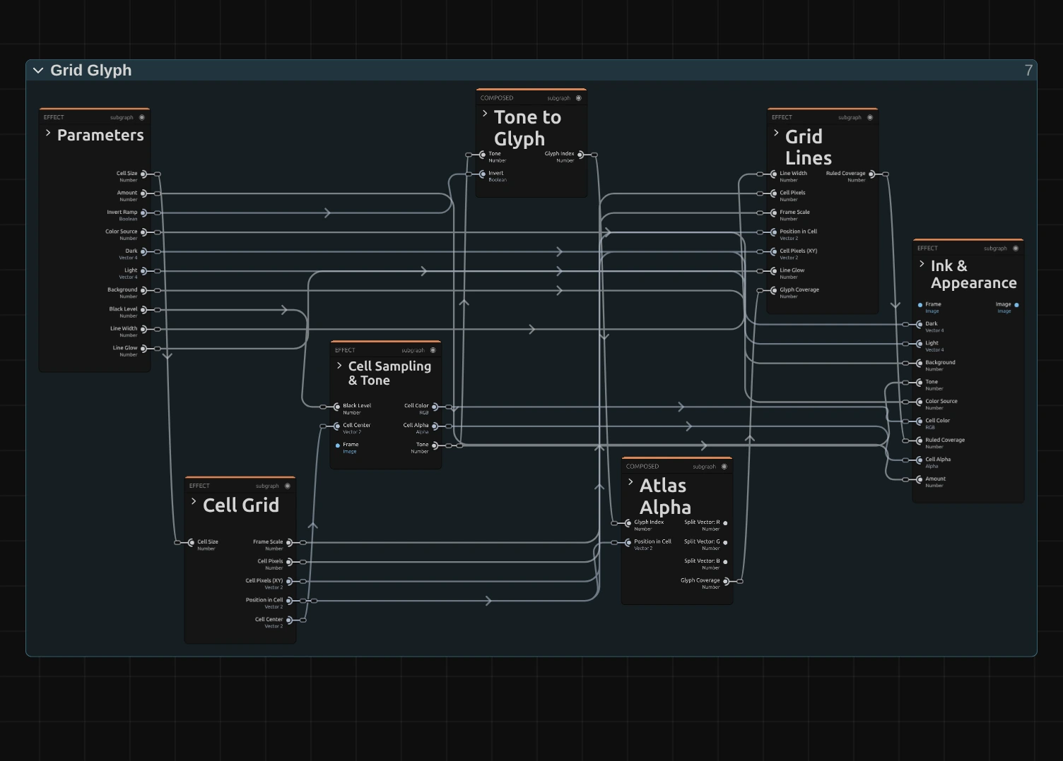
Grid Glyph works in six stages, one folder each in the Nodes tab: Cell Grid cuts the frame into square cells, Cell Sampling & Tone reads the colour and brightness in the middle of each cell, Tone to Glyph picks a character of the ramp for that brightness, Atlas Alpha looks up where the character covers the cell, Grid Lines rules the lines along the cell borders into that coverage, and Ink & Appearance colours the character, its lines and its ground. Click a folder’s header to open it. Grid Lines makes the grid; the other folders work as in ASCII. Grid Glyph is one look of the glyph engine that the Text & Glyph looks share; its Style menu switches between them.
Cell Grid
Section titled “Cell Grid”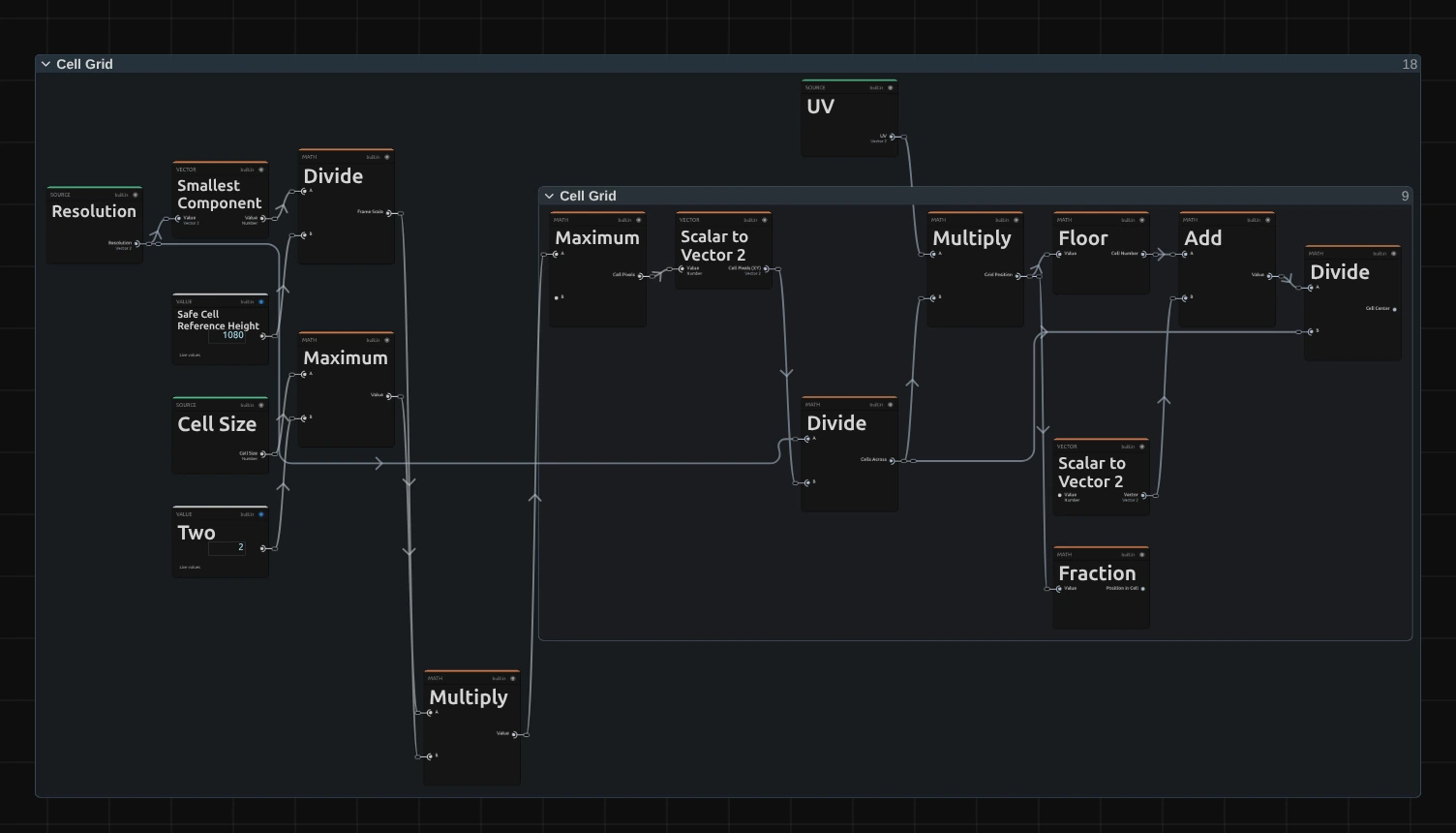
Smallest Component – the shorter side of the frame; divided by 1080 it scales Cell Size and Line Width, so a 4K export, a portrait frame and a thumbnail show the same grid.
Maximum – the cell size in pixels of this frame, never smaller than 2.
Floor – which cell the pixel lies in, counted in columns and rows.
Fraction – where the pixel lies inside its cell, from 0 to 1; Atlas Alpha draws the character with it, and Grid Lines finds the borders with it.
Divide – the middle of the cell, where the whole cell reads the picture.
Cell Sampling & Tone
Section titled “Cell Sampling & Tone”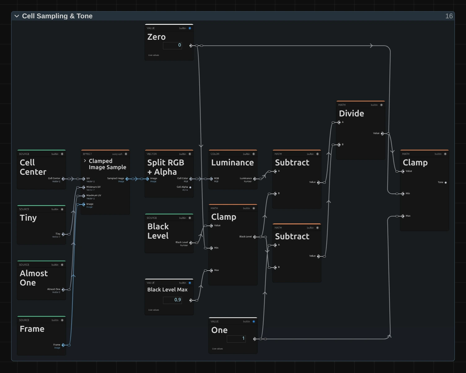
Clamped Image Sample – reads the input picture at the cell centre, never outside the frame.
Split RGB + Alpha – the cell’s colour and its transparency. The colour becomes the ink of the character and its lines, the transparency that of the whole cell.
Luminance – the brightness of the cell colour, weighted the way the eye sees it (green counts most).
Divide – applies Black Level: the luminance minus Black Level (Subtract), divided by what is left above it (the other Subtract: One minus Black Level). The Clamp next to Black Level keeps it between 0 and Black Level Max 0.9.
Clamp – keeps the result between 0 and 1, so everything darker than Black Level becomes 0: the Tone. It picks the character.
Tone to Glyph
Section titled “Tone to Glyph”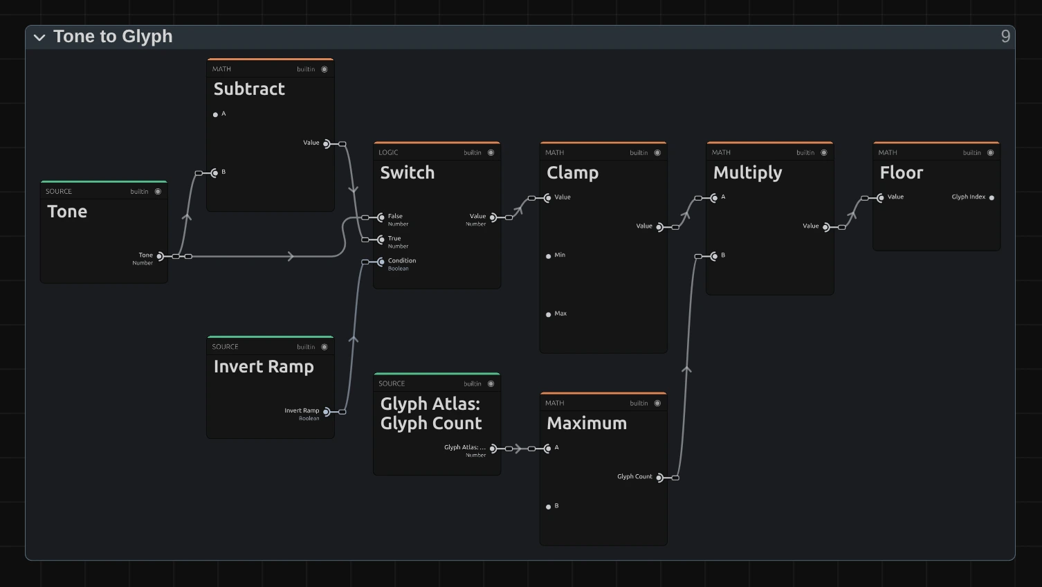
Subtract – one minus the tone, for Invert Ramp.
Switch – the tone as it is, or inverted when Invert Ramp is on.
Clamp – keeps the tone just under 1, so the brightest cells get the last character and never one past it.
Multiply – spreads the tone over the number of characters in the ramp.
Floor – drops the fraction: the number of the character, 0 for the first (the space of the Standard ramp) up to the last.
Atlas Alpha
Section titled “Atlas Alpha”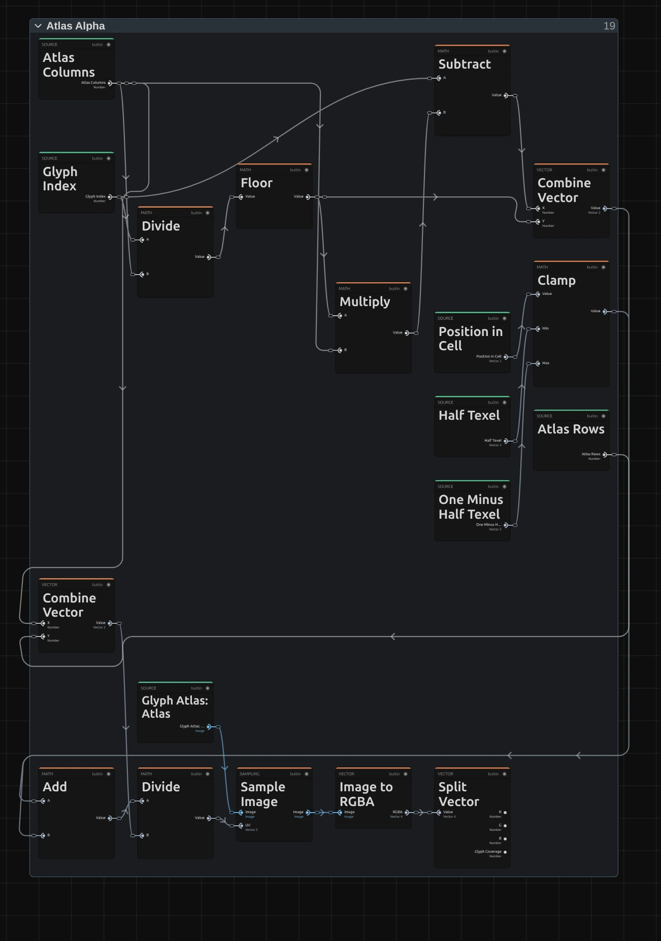
Floor – the row of the character on the atlas, a sheet of all characters of the ramp drawn in the chosen Font and Weight.
Subtract – its column on the sheet.
Clamp – keeps the place inside the cell half a pixel of the sheet away from the edges of the character’s square (Half Texel, 0.5 of the 64 pixels of a square, and One Minus Half Texel), so the smoothed read never mixes in the neighbouring character.
Sample Image – reads the sheet at the character’s square plus the place inside the cell.
Split Vector – the Glyph Coverage: 1 inside the strokes of the character, 0 around them. Grid Lines rules the lines into it.
Grid Lines
Section titled “Grid Lines”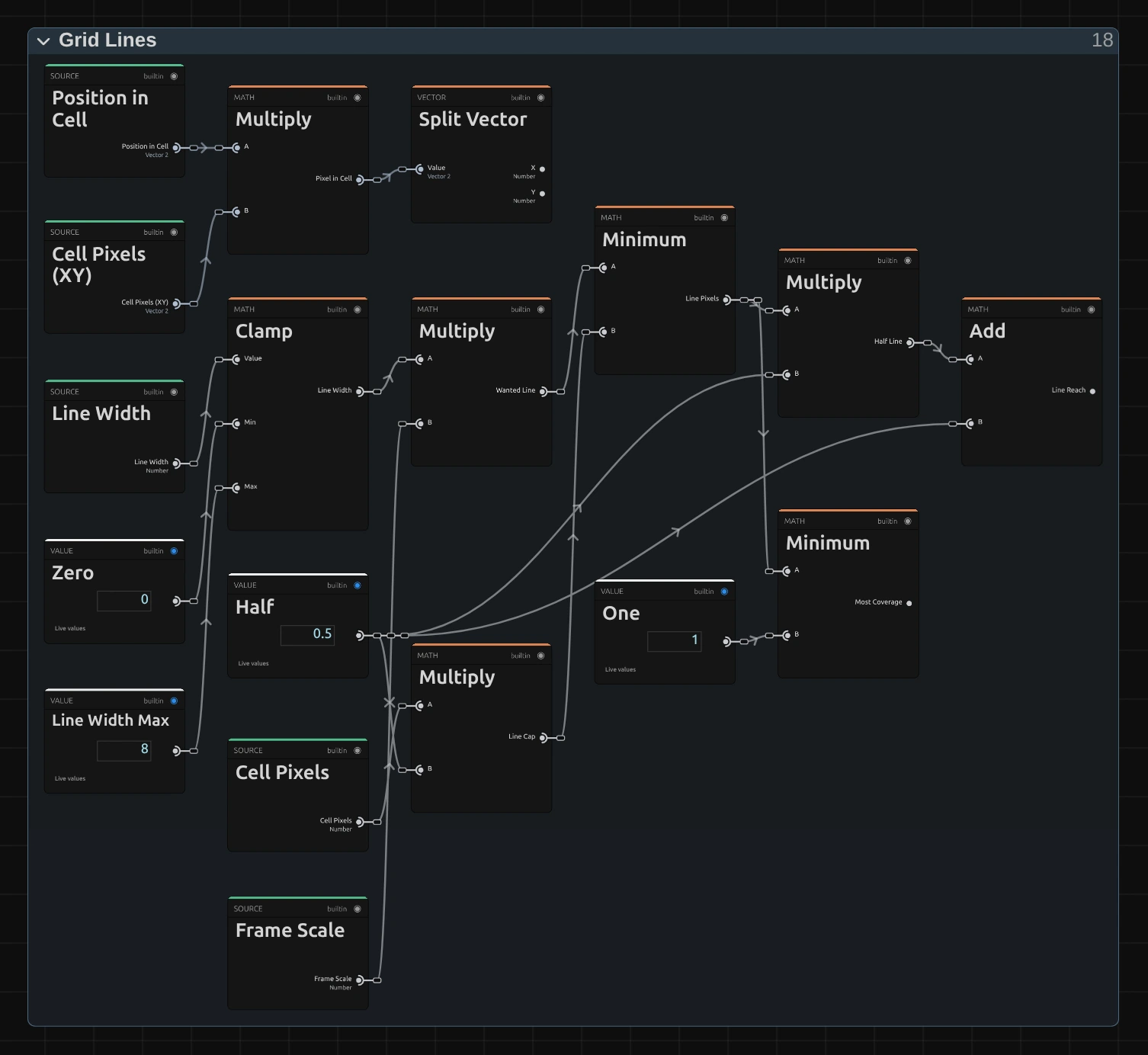
Wanted Line – Line Width times Frame Scale (the shorter side of the frame divided by 1080, from Cell Grid): how many pixels of this frame the line should be wide. The Clamp before it keeps Line Width between Zero and Line Width Max 8; a larger value renders as 8, and the card says so.
Line Cap – Cell Pixels times Half (Multiply): half a cell, the widest a line may be, so the characters always keep part of their box.
Line Pixels – the smaller of the Wanted Line and the Line Cap (Minimum): the line as it is drawn. When the cap cuts it, the card says so.
Half Line – Line Pixels times Half: the part of the line on each side of its middle.
Line Reach – the Half Line plus a half (Add): a pixel whose middle lies closer than this to the middle of a line is touched by it.
Most Coverage – the smaller of Line Pixels and One (Minimum): a line thinner than a pixel covers a pixel at most by its own width, so it draws fainter instead of vanishing.
Pixel in Cell – Position in Cell times the cell size in pixels (Cell Pixels (XY)): where the pixel lies inside its cell, in pixels from its top-left corner. Split Vector passes on its two parts, across and down.
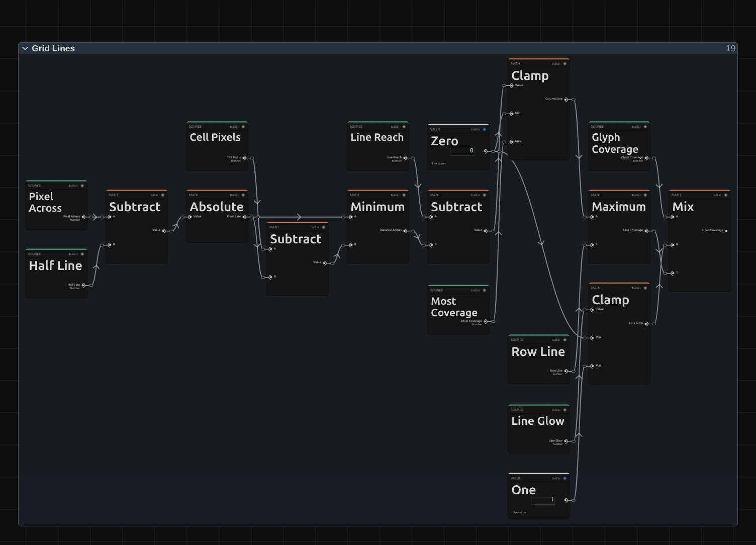
Absolute – how far the pixel lies from the middle of its own cell’s line, which runs a Half Line inside the cell’s left edge: Pixel Across minus Half Line, without its sign.
Distance Across – the nearer of that and the distance to the next cell’s line (Cell Pixels minus it): Minimum picks it.
Column Line – Line Reach minus Distance Across, clamped between Zero and Most Coverage: how much of the pixel the column line covers, 1 inside a line, a share at its edges, 0 beyond. Each pixel gets exactly the part of the line it holds, so a hairline weighs the same at every frame size, also where a cell is not a whole number of pixels. The rows work the same way from Pixel Down and give the Row Line.
Line Coverage – the larger of Column Line and Row Line (Maximum): where the grid lies.
Ruled Coverage – moves the Glyph Coverage towards Line Glow (its Clamp keeps it between 0 and 1) by the Line Coverage (Mix): inside a line the coverage is Line Glow, whatever character lies there; elsewhere the character as it is. So a low Line Glow darkens a full block along the line and a higher one lights the empty ground.
Remix: open Grid Lines, find the Clamp whose output is Row Line and drag a cable from that output onto T of the Mix at the end (Ruled Coverage): the columns drop out and only the rows stay ruled, like text on lined paper.
Ink & Appearance
Section titled “Ink & Appearance”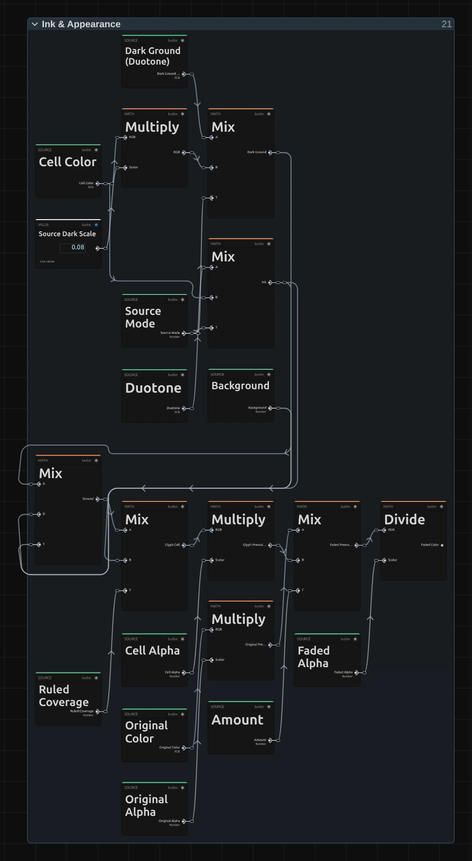
Ink – the colour of the character and its lines: the cell colour with Color Source set to Source, the Duotone colour (from Dark to Light by the tone) with Duotone.
Dark Ground – the cell behind the character as classic ASCII art has it: the cell colour times 0.08 with Source, Dark times 0.15 with Duotone.
Ground – mixes the dark ground towards the ink by Background: at 0.2 the cell keeps a fifth of its character’s colour.
Glyph Cell – puts the ink on the ground by the Ruled Coverage from Grid Lines: the character in full colour, the lines at Line Glow, the ground around them.
Faded Color – fades the untouched picture, pixel by pixel, towards the glyph cell by Amount and divides by the faded alpha. Both are first multiplied by their transparency, so the colour a transparent pixel hides never shows as a fringe around a cut-out figure.
Technical details
Section titled “Technical details”- Size. Cell Size and Line Width count pixels of a frame whose shorter side is 1080: a 4K export, a portrait 1080 × 1920 frame, a lower Preview Quality and the thumbnails show the same grid. Each pixel takes the share of it a line covers, so a line thinner than a pixel draws fainter rather than vanishing, and the grid has the same weight at every size. A cell is never smaller than 2 pixels; below 2 px Cell Size renders as 2. Line Width above 8 px or above half a cell, and Line Glow outside 0 to 1 render clamped. The card says when any of this happens.
- Lines. Every cell rules its top and left edge, so each border is one line; where the frame ends inside a cell, at the right or bottom, that cell stays open. Inside a line the coverage is Line Glow whatever the character, so lines cut through characters that reach the edge of their box.
- Characters. The characters come from an atlas, a sheet the engine draws for the Ramp, Font and Weight and keeps. Its tallest character spans 88 % of the box height; the Block Elements (█ ▀ ▄ ▌ ▐ ░ ▒ ▓ and the bars) are exact shapes that fill their box in any font. Weight is drawn in steps of 100.
- Time. Grid Glyph does not move by itself: on footage it changes with every frame of the clip, the grid stays put, and a paused picture needs no extra rendering.
- Transparency. Each cell, its character and its lines take the transparency of the cell’s centre, so a cut-out figure keeps its outline in whole cells. Amount fades the transparency back to the original’s, pixel by pixel, without a fringe.
- Saved projects. A Grid Glyph that stores its node setup keeps its look, including the earlier line, a fixed share of each cell. Effects saved without a stored setup get the new lines at 1 px and the earlier strength (Line Glow 0.28). This is a fix: the earlier line vanished at half Preview Quality and came and went where a cell was not a whole number of pixels, so preview and export differed. New effects start at Cell Size 18. Presets fully apply only to effects added in this version: a stored setup from before has no Background, Black Level, Line Width or Line Glow row, so a preset leaves those values out.
- More: Effect system · Node Catalog · Styles and presets.